Rapid Friday Sale is Live!
Get exclusive discounts on all products
Dec 07, 2025

4 min read

Diving into the alert in React Native is refreshingly simple, thanks to the built-in Alert.alert() method. This core API is your go-to for showing a native dialog with a title, an optional message, and a set of buttons. It's really the bedrock of in-app user notifications.
Let's get right into the practical side of things. The built-in Alert API is the quickest way to present users with critical info and get their feedback. The best part? It doesn’t require any extra installations and just works, making it perfect for common tasks like asking for confirmation or showing a quick warning.
If you’re just getting started and need to get a project off the ground, our Expo React Native tutorial is a great place to set up your environment.
The Alert.alert() method is more flexible than it first appears. At its core, you give it a title and a message, but the real power lies in the optional array of buttons you can pass along. This is where you bring your dialog to life with interactive choices.
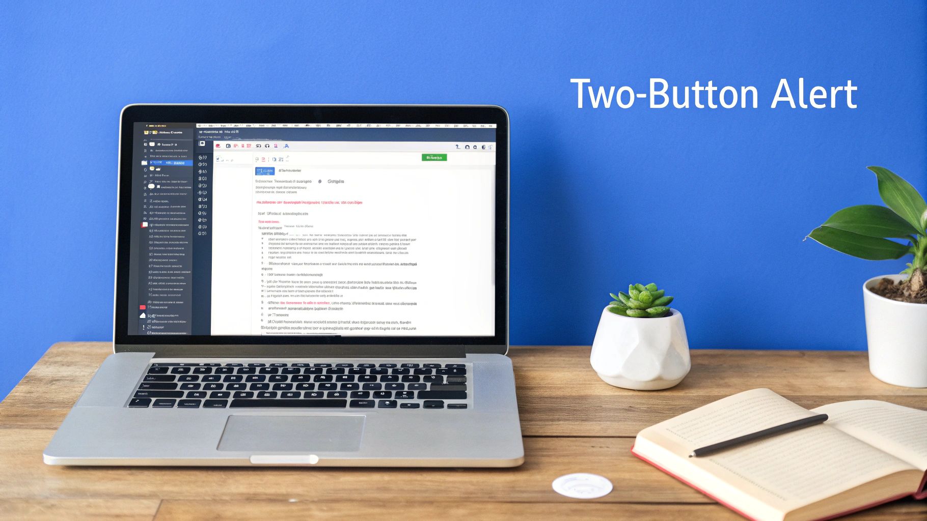
By far, the most common use case is a simple "Are you sure?" dialog. Let's say a user is about to delete something important. A two-button alert—one for "Cancel" and one for "Delete"—is exactly what you need.
Here’s a quick TypeScript example that you can drop into any Expo or React Native CLI project:
import { Alert, Button, View } from 'react-native';
const showConfirmDialog = () => { return Alert.alert( "Are you sure?", "Do you really want to delete this item? This process cannot be undone.", [ // The "No" button { text: "Cancel", style: "cancel", }, // The "Yes" button { text: "Delete", onPress: () => { // Perform the delete action console.log("Item deleted!"); }, style: "destructive", }, ] ); };
// Component using the alert const App = () => ( <View style={{ flex: 1, justifyContent: 'center', alignItems: 'center' }}> <Button title="Delete Item" onPress={showConfirmDialog} /> </View> );
Each button in the alert is defined by an object in the buttons array. Getting to know these properties will let you tailor the user experience.
| Property | Type | Description | Platform |
|---|---|---|---|
text |
string |
The label that appears on the button. | All |
onPress |
function |
The callback function that runs when the user taps the button. | All |
style |
string |
Determines the button's appearance. Can be default, cancel, or destructive. |
iOS |
isPreferred |
boolean |
If true, this button's text will be bolded to indicate it's the primary action. |
iOS |
These properties give you fine-grained control over how users interact with your alerts, especially on iOS where styles have a distinct visual impact.
A great little UX touch on iOS is the
destructivestyle, which automatically turns the button text red. It’s a clear visual cue for an action that can't be undone. Similarly, thecancelstyle usually places the button where users instinctively look to back out of a flow.
The native Alert API is an incredibly powerful tool for communicating directly with your users. While you can't heavily style it, its platform-native look and feel provide a consistent and familiar experience. It’s a must-have in your toolkit, particularly since cross-platform APIs can get tricky. A recent State of React Native survey even found that platform-specific APIs are one of the top five most-used yet most problematic areas for developers. For a deeper dive into these developer trends, check out the full report on InfoQ.

While React Native does an incredible job of letting you "write once, run anywhere," the built-in Alert API is a classic reminder that you're still building for two very different operating systems. One of the first hurdles developers hit is the gap between how iOS and Android handle alerts. If you don't account for these differences, you're looking at a confusing or, worse, a broken user experience.
The biggest offender? The text input prompt. iOS gives you a slick, built-in alert style with a text field baked right in—perfect for things like quick password confirmations or getting user input. Android, on the other hand, just doesn't have an equivalent in its native alert system. If you try to call an input prompt on Android, it won't just look different; it will fail silently, leaving the user staring at the screen wondering why nothing happened.
This is a really important distinction to grasp. If you're starting a new app, you need to plan for this from day one. And for anyone just getting their dev environment squared away, our guide on a proper React Native setup can help make sure your project is configured to handle these kinds of platform-specific challenges.
So, how do you deal with this? The solution is React Native's Platform.OS module. It's a simple but powerful tool that lets you check which operating system the code is running on. By wrapping your logic in a quick if (Platform.OS === 'ios') check, you can show the rich input prompt on Apple devices and provide a smart fallback for Android users.
Let's imagine you need to ask for a password to confirm a sensitive action. Here's how you'd tackle it:
import { Alert, Platform } from 'react-native';
const promptForPassword = () => { if (Platform.OS === 'ios') { // On iOS, we can use the slick 'secure-text' prompt. Alert.prompt( 'Enter Password', 'Please enter your password to continue.', [ { text: 'Cancel', style: 'cancel', }, { text: 'OK', onPress: password => console.log('Password entered: ' + password), }, ], 'secure-text' ); } else { // Android gets a standard alert. We can't ask for a password here, // so we guide the user to another screen. Alert.alert( 'Confirmation Required', 'This action requires you to re-authenticate. Please proceed to the settings screen.', [ { text: 'OK' } ] ); } };
This snippet splits the logic perfectly, ensuring you’re delivering a native, functional experience no matter the device.
Pro Tip: Never assume a feature works the same on both platforms. I can't stress this enough. Always test your alerts on real iOS and Android devices. You'd be surprised by the subtle differences in button layouts, text rendering, and interactions that can completely change the user experience.
The differences don't stop at input prompts. Button styling is another area where you'll see platform-specific behavior. iOS gives you three distinct button styles: default, cancel, and destructive. That destructive style is super useful—it automatically colors the button text red to signal a potentially dangerous action, like deleting a file.
On Android, though, the destructive style has no visual effect. The button will look exactly like a default one.
Button placement is another classic quirk. iOS tends to put the cancel button on the left, while Android’s Material Design guidelines often stack buttons or place the main positive action on the far right. React Native is smart enough to handle these placements for you, but it’s something to keep in mind when writing your button text to make sure the user flow feels intuitive on each OS.
Sooner or later, every developer hits a wall with the native Alert API. It’s a workhorse, absolutely fantastic for quick confirmations and simple messages. But let's be honest, its default, platform-specific look just doesn't fly when you're trying to build a polished, branded app experience.
To really take ownership of your app's look and feel, you need to step up to custom alert modals. This move gives you complete control over everything—styling, animations, and the content inside. It’s how you go from a generic app to your app.
The biggest reason? Design flexibility. A custom modal blows the doors wide open. You're no longer stuck with just a title, a message, and a couple of buttons. Need to pop up an alert with an image, an input field, or even a slider? No problem. This is how you create a truly unique experience that feels completely integrated with your app's design language.
If you're serious about creating a consistent visual identity, building reusable components like a custom alert is a cornerstone. Our guide on creating a React Native design system is a great place to start mapping this out.
The other huge win is cross-platform consistency. We've already seen how the native Alert API looks different on iOS versus Android. A custom modal, built with standard React Native components, will look and behave exactly the same everywhere. That means a predictable, polished UI for all your users.
When it's time to build, you don't have to start from zero. One of the most popular and powerful libraries out there is react-native-modal. It's a souped-up version of the core Modal component, adding easy-to-use props for animations, timing, and even swipe gestures. It makes building sophisticated alerts surprisingly simple.
To help you decide which tool is right for the job, here's a quick side-by-side look.
While the native Alert is perfect for speed and simplicity, a custom modal offers unparalleled control for a more branded experience.
| Feature | Native Alert API | Custom Modal (e.g., react-native-modal) |
|---|---|---|
| Styling | Limited to default platform styles | Fully customizable with StyleSheet |
| Content | Text-only (title, message, buttons) | Supports any React Native component |
| Animations | Platform-default (e.g., fade on Android) | Highly configurable (slide, fade, zoom) |
| Development Effort | Minimal, single function call | Higher, requires component creation |
| Cross-Platform Look | Inconsistent (native look on each OS) | Consistent across iOS and Android |
Essentially, the choice comes down to weighing the quick-and-easy approach against the need for a fully tailored user interface.
Building a custom alert with this library means you'll create a new component that wraps react-native-modal. Inside, you're free to use standard <View>, <Text>, and <Button> components to structure your alert precisely as you've designed it. You then toggle its visibility using a state variable tied to the modal's isVisible prop.
Pro Tip: Create a single, reusable custom alert component. By centralizing your app's notification logic this way, you can trigger a beautifully branded, consistent alert from anywhere in your codebase with a simple function call—just like the native API.
This approach really gives you the best of both worlds: the dead-simple implementation of a function call combined with the power of complete customization. It's a smart move that will definitely elevate your app's overall quality and user experience.
Look, not every message your app sends needs to bring everything to a screeching halt. A modal alert in React Native is your go-to for critical, can't-be-undone actions like deleting an account. But for simple feedback? It’s often overkill and just plain annoying for the user. Nailing the user experience means picking the right tool for the right moment.
This is where you have to understand the difference between modal and non-modal notifications. Modal alerts, like the ones you get from the core Alert API, are blocking. They pop up, demand the user's full attention, and pause everything else until they're dealt with. That’s their job—they’re for the big, important decisions.
On the other hand, you have non-modal notifications like toasts or snackbars. These are way more chill. They slide onto the screen for a few seconds to say "Profile saved" or "Message sent," and then fade away on their own. The user’s workflow isn't interrupted at all.
This little diagram sums it up nicely when you're deciding what to build.
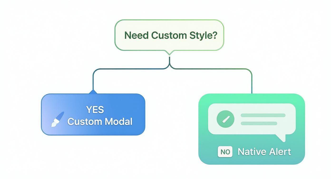
Basically, if your design team has a very specific look they want, you’ll probably need a custom modal. If not, the native Alert is often the quickest and most straightforward path.
So, when should you reach for a toast? Think about any situation where you want to give the user helpful but non-essential info.
To implement these, a library like react-native-toast-message is a fantastic, lightweight choice. It gives you a dead-simple API to show different toast types (success, error, info) with just one function call.
import Toast from 'react-native-toast-message';
const showSaveConfirmation = () => { Toast.show({ type: 'success', text1: 'Success!', text2: 'Your profile has been updated.' }); };
This tiny snippet keeps the user in the loop without ruining their flow. The way you use notifications has a huge impact on how users feel about your app. We've seen firsthand how push notifications and in-app alerts can make or break user engagement. In fact, users who get daily notifications can have an 820% higher retention rate than those who get none. If you're curious, you can dig into more push notification statistics to see the full picture.
Choosing the right tool isn't just a technical decision; it's a UX one. Overusing modal alerts leads to "alert fatigue," where users just start smashing the 'OK' button without reading a thing. Save them for moments that genuinely require a user to stop and think.
By thoughtfully balancing blocking alerts with gentle toasts, you create a communication system that feels helpful, not demanding. It’s this kind of nuance that separates a decent app from a polished, professional one.
https://www.youtube.com/embed/59_P5Eq47Rc
Anyone can trigger an alert. That's the easy part. The real art is crafting one that genuinely helps your users without becoming a source of frustration. A poorly timed or confusing dialog can absolutely tank the user experience.
If you follow a few core principles, you can transform a basic alert in React Native from a disruptive pop-up into a valuable, seamless part of your app.
It all starts with clarity. Your user needs to immediately understand what’s happening, why, and what their options are. Vague messages like "Error Occurred" are next to useless. Get specific. Something like "Connection Lost. Please check your internet and try again" tells them exactly what they need to know.
This same thinking applies directly to your button labels. Ditch generic terms like "OK" or "Yes/No" whenever you can. Instead, use action-oriented text that clearly describes the outcome. If you’re asking for a deletion confirmation, buttons labeled "Cancel" and "Delete" are infinitely more intuitive than a vague "No" and "Yes."
Accessibility isn't a "nice-to-have" feature you tack on at the end—it's a fundamental requirement for a high-quality app. For someone relying on a screen reader like VoiceOver or TalkBack, a badly implemented alert can be a dead end.
The good news is that the native Alert API handles the basics pretty well out of the box, correctly announcing the title, message, and button roles. But it's on you to make sure your content is structured logically. The title should be a clear question or statement, and the message should provide any necessary context.
Here are a few critical checkpoints for every alert you build:
Remember, accessibility benefits everyone. Clear language and a logical flow make the alert easier for all users to understand, not just those using assistive technologies. It’s just good, inclusive design.
From a code perspective, try to avoid triggering alerts from deep within your component tree. It’s a recipe for messy, hard-to-manage code. Things get even worse if multiple alerts fire at once, creating an annoying stack of dialogs that traps the user.
A much cleaner approach is to manage alerts through a global system, like Redux, Zustand, or React Context. You can create a centralized service or hook that your components call to request an alert. This service then manages a queue, ensuring only one alert is shown at a time.
Centralizing this logic gives you a predictable user experience and makes it way easier to implement app-wide rules, styling, and accessibility standards for every single alert in your application.
When you start working with alerts, a few common questions always seem to pop up, especially once you move past the basic implementations. Let's tackle some of the most frequent sticking points developers hit when adding an alert in React Native.
This is easily the most common question, and I'll give you the straight answer: you can't.
The built-in Alert.alert() component is a wrapper around the platform's native UI. That means it automatically adopts the standard look and feel of whatever device it's running on, whether that's iOS or Android. While this is great for creating a familiar user experience, it gives you almost zero control over styling.
The only "styling" you get is with the button types, which behave differently on each OS:
default: Your standard, run-of-the-mill button.cancel: On iOS, this often gives the button a bolder font weight or a special position to signal it's the "out."destructive: This turns the button text red on iOS, a clear warning for actions like deleting something. On Android, it looks just like a default button.If you absolutely need custom colors, fonts, or a completely different layout, you'll have to roll up your sleeves and build a custom modal. A library like react-native-modal is your best friend here, giving you a blank canvas to style with standard StyleSheet properties.
Nope, you can't do that. The Alert.alert() API requires you to define at least one button in the buttons array. At its core, an alert is an interactive dialog, and it needs a way for the user to close it. If you try to create one without a button, your app will throw an error.
If you're just trying to show a quick, non-interactive message—like a "Profile Saved!" confirmation—an alert is the wrong tool for the job. You're better off using a Toast or a Snackbar. These UI patterns are perfect for providing quick feedback without stopping the user in their tracks.
Good news here: the onPress handler for an alert button plays nicely with asynchronous functions. You can simply declare the handler as async and use await inside it to manage API calls, save data to a database, or kick off any other background task.
Here’s a practical example:
Alert.alert( "Confirm Action", "Are you sure you want to proceed?", [ { text: "Cancel", style: "cancel" }, { text: "Proceed", onPress: async () => { try { await performAsyncTask(); console.log("Async task complete!"); } catch (error) { Alert.alert("Error", "Something went wrong."); } }, }, ] );
A pro tip I can't stress enough: always wrap your async logic in a
try...catchblock. This is a lifesaver. If the network flakes out or the server returns an error, you can catch it and show another alert telling the user what happened. It’s a simple step that makes your app feel much more polished and resilient.
Ready to build faster without starting from scratch? theappmarket offers a massive collection of production-ready React Native templates to help you launch your next app in record time. Explore our catalog and find the perfect foundation for your project at https://theappmarket.io.

Dec 08, 2025
4 min read
android login with facebook: Learn to set up the Facebook SDK, manage tokens, and implement secure authentication across native Android, cross-platform apps.
Dec 06, 2025
4 min read
keyboardavoidingview react native: Master keyboard handling with KeyboardAvoidingView across iOS, Android, Expo, and TypeScript.

Dec 05, 2025
4 min read
A practical guide to implementing a React Native PDF viewer. Learn to compare libraries, handle native setup, and troubleshoot common issues with real code.

Dec 04, 2025
4 min read
how to validate startup idea: learn proven methods like customer interviews, MVPs, and metrics to confirm market fit.

Dec 03, 2025
4 min read
how to make app like uber: Learn core features, tech stack, development steps, testing, and launch tips.

Dec 02, 2025
4 min read
Build a rock-solid React Native setup. This guide covers Expo vs. Bare workflows, TypeScript, pnpm monorepos, NativeWind, and deployment strategies.

Dec 01, 2025
4 min read
A practical guide to Stripe React Native integration. Learn to set up your server, build payment UIs, handle webhooks, and launch secure mobile payments.

Nov 30, 2025
4 min read
Learn how to master push notifications in React Native. This guide covers setup, best practices, and advanced techniques for engaging your users.

Nov 29, 2025
4 min read
Build powerful location-based apps with our practical guide to react native with google maps. Get setup guides, pro tips, and best practices for iOS & Android.

Nov 28, 2025
4 min read
Explore deep linking react native with a practical guide to configuring URL schemes, universal links, navigation, and testing for Expo and bare apps.

Nov 28, 2025
4 min read
A practical guide to building a scalable React Native design system. Learn to implement tokens, theming, and tools like NativeWind and gluestack-ui.

Nov 26, 2025
4 min read
Learn why react native expo templates speed up your projects with ready-made patterns and practical tips.

Nov 25, 2025
4 min read
Discover how to improve developer productivity with actionable strategies for workflow, tooling, and culture. A practical guide for software engineering teams.

Nov 24, 2025
4 min read
Discover the best cross platform app development tools. Compare top frameworks like Flutter and React Native to build and ship apps faster.

Nov 23, 2025
4 min read
This Expo React Native tutorial provides a hands-on guide to building cross-platform apps. Learn setup, styling with NativeWind, navigation, and deployment.

Nov 22, 2025
4 min read
Build beautiful UIs faster with this guide to Tailwind CSS React Native. Learn setup, styling, and advanced techniques with NativeWind for mobile apps.

Nov 21, 2025
4 min read
Explore our curated list of 7 top-tier React Native app examples. Discover production-ready templates and resources to build your next app faster.

Mar 19, 2025
4 min read
theappmarket offers React Native UI templates to accelerate development. Get customizable, production-ready React Native app templates and Ui kit, some free. Build faster & smarter today!