Rapid Friday Sale is Live!
Get exclusive discounts on all products
Dec 06, 2025

4 min read


Let's be real—nothing kills a user's vibe faster than the on-screen keyboard popping up and hiding the exact spot they need to type. It's a classic headache in mobile development, and frankly, it just looks unprofessional. This is exactly why React Native gives us KeyboardAvoidingView, a built-in component designed to get that keyboard out of your UI's way.

Picture a user signing up for your app. They tap the email field, the keyboard slides up, and—poof—the password field and the "Sign Up" button vanish. Now they have to close the keyboard just to see what’s next. It’s clunky, annoying, and a surefire way to get someone to abandon your app.
The root of the problem is that the native keyboard is just an overlay; it doesn’t actually reflow your app's layout. It just sits on top of everything. Without a solid fix, your beautifully designed forms become a frustrating mess on smaller devices. This is where KeyboardAvoidingView steps in to save the day.
This component was created specifically to fix this universal problem. You wrap it around your form or screen, and it listens for keyboard events. When the keyboard shows up, KeyboardAvoidingView automatically shifts your content by adjusting its height, position, or padding to keep the focused input visible.
It became an essential tool around 2016-2017 and has been a lifesaver for building intuitive forms ever since. Its main knob is the behavior prop, which you can set to values like padding or height to tell it how to move your content. With the right configuration, you can eliminate nearly 100% of keyboard overlap issues. You can read a bit more about how React Native handles this over on MageComp.
My personal rule of thumb is simple: if a screen has more than one
TextInput, it gets wrapped in aKeyboardAvoidingView. It’s a tiny bit of effort that prevents a massive UX failure. Trust me, it’s much better to add it upfront than to debug a broken form later.
Using KeyboardAvoidingView isn't just about squashing a bug; it's about fundamentally improving how your app feels to use. The main wins are pretty clear:
Of course, mastering this component means getting familiar with its quirks, especially the behavioral differences between iOS and Android. Let's dive into those platform-specific details and how to handle them.
Choosing the right behavior prop is the most critical part of getting KeyboardAvoidingView to work correctly. The effect of each value can differ significantly between iOS and Android, so it's essential to know which one to pick for your situation.
Here's a quick cheat sheet to help you decide.
| Behavior Prop | Effect Description | Best For iOS | Best For Android |
|---|---|---|---|
padding |
Adds padding to the bottom of the view, pushing content up from the keyboard. | The most common and reliable choice. Great for forms within a View. |
Often doesn't work as expected. Usually better to use other solutions. |
height |
Resizes the component's height, shrinking it to make room for the keyboard. | Works well, especially for full-screen views that need to resize. | Can be effective, but often requires more manual layout adjustments. |
position |
Repositions the entire view by changing its bottom or top style property. |
Useful for specific layouts, but padding is generally more predictable. |
Rarely the best option; can lead to components being pushed off-screen. |
As you can see, padding is usually the go-to for iOS, while Android often requires a different approach (which we'll cover later in this guide). Experimenting with these is key, but this table should give you a solid starting point.

Alright, we've covered the theory. Now it's time to get our hands dirty and see how this actually works in a real app. We're going to build a simple login screen using an Expo and TypeScript setup—a stack I use all the time for modern React Native projects.
My goal here isn't just to dump a block of code on you. I want to walk you through the why behind each line. You’ll see exactly how to wrap your form elements and, critically, how to configure the KeyboardAvoidingView props so your app feels right on both iOS and Android.
First things first, let's get a basic component structure in place. If you’re just starting out with Expo, our Expo React Native tutorial is a fantastic guide for getting a new project off the ground.
Here’s the starter code for a LoginScreen component. It’s pretty barebones: a View, two TextInput fields for email and password, and a Button. I've intentionally left KeyboardAvoidingView out for now so we can see the problem we're trying to solve.
import React from 'react'; import { StyleSheet, Text, View, TextInput, Button, SafeAreaView, } from 'react-native';
const LoginScreen = () => { return ( <SafeAreaView style={styles.container}> <View style={styles.inner}> <Text style={styles.header}>Login</Text> <TextInput placeholder="Email" style={styles.input} /> <TextInput placeholder="Password" style={styles.input} secureTextEntry /> <Button title="Login" onPress={() => console.log('Login Pressed')} /> </View> </SafeAreaView> ); };
const styles = StyleSheet.create({ container: { flex: 1, }, inner: { padding: 24, flex: 1, justifyContent: 'center', }, header: { fontSize: 36, marginBottom: 48, }, input: { height: 40, borderColor: '#ddd', borderWidth: 1, marginBottom: 12, padding: 10, }, });
export default LoginScreen; If you run this code and tap into the password field, you'll see the keyboard pop up and completely cover the login button. It's a classic, and very frustrating, UX problem.
Let's fix it. The trick is to wrap the content that needs to get out of the way inside the KeyboardAvoidingView. For our login screen, that means wrapping the inner View that holds our inputs and button.
The most important decision you'll make is which behavior prop to use. This is where the platform differences really show up. A solid, cross-platform strategy is to use the Platform API to set it dynamically.
On iOS,
behavior="padding"is your best friend. It just works. It smoothly adds padding to the bottom of the screen. Android is a bit trickier;behavior="height"can work, but you'll often get the best results by tweaking yourAndroidManifest.xmlsettings alongside it.
Here’s how we'll update the component to handle this:
import { KeyboardAvoidingView, Platform, // ...other imports } from 'react-native';
const LoginScreen = () => { return ( <SafeAreaView style={styles.container}> <KeyboardAvoidingView behavior={Platform.OS === 'ios' ? 'padding' : 'height'} style={styles.container} > <View style={styles.inner}> {/* ... TextInputs and Button remain here ... */} </View> </KeyboardAvoidingView> </SafeAreaView> ); };
By wrapping our content and setting the behavior based on the OS, we’ve already made our component much more user-friendly. The flex: 1 style on the wrapper is crucial—it tells the view to take up all available space, which is necessary for the layout adjustments to work correctly.
But what if your screen has a fixed header, maybe from a library like React Navigation? If you're not careful, KeyboardAvoidingView will push your inputs right up under the header. Not a great look.
This is exactly what the keyboardVerticalOffset prop was made for. It lets you tell the component to account for the height of elements like a header.
You just need to define your header's height and pass that value to the prop.
const HEADER_HEIGHT = 60; // Your actual header height
<KeyboardAvoidingView behavior={Platform.OS === 'ios' ? 'padding' : 'height'} style={styles.container} keyboardVerticalOffset={HEADER_HEIGHT}
{/* Your content */} </KeyboardAvoidingView>
This one line tells the component to start its calculations 60 pixels down from the top. Your header stays visible, and your content animates perfectly into view. It's these small details that elevate an app from functional to professional. Mastering this keyboardavoidingview react native component is non-negotiable for building great forms.
With these steps, you now have a solid, copy-paste-ready foundation for any form in your Expo and TypeScript projects. This approach handles the most common scenarios and gives you a robust starting point for even more complex layouts.

So far, we’ve tackled forms that fit neatly onto a single screen. But what happens when you're building a detailed registration page, a long settings screen, or even a chat interface? When your content inevitably overflows the viewport, you’ll reach for a ScrollView or FlatList. This is where a lot of developers get tripped up.
Combining KeyboardAvoidingView with a scrollable container introduces a new layer of complexity. If you get the nesting wrong, you'll see all sorts of strange behavior: the screen might jump erratically, inputs can get pushed completely out of view, or the keyboard avoidance might not even trigger at all. The key is to structure your components so they work together, not against each other.
The most common mistake I see is wrapping the ScrollView inside the KeyboardAvoidingView. It seems logical at first, but it often leads to layout conflicts because both components are trying to manage the view's size and position at the same time.
The correct—and most reliable—pattern is to place the KeyboardAvoidingView inside the ScrollView or FlatList. This approach lets the scrollable container manage the overall layout, while the keyboard avoider is only responsible for adjusting its immediate children.
Here's why this setup is so effective:
ScrollView handles the scrolling, and KeyboardAvoidingView handles the keyboard. Each component has one job, and it does it well.ScrollView's content container grows as needed, and the keyboard avoider simply adds padding at the bottom when the keyboard appears. No fighting, no fuss.Let's build something practical. Imagine a registration form with a ton of fields—name, email, password, address, and more. This will definitely require scrolling on smaller devices.
We'll use a ScrollView to contain all our form elements. Then, inside it, we'll place the KeyboardAvoidingView to wrap our TextInput components.
import React from 'react'; import { ScrollView, TextInput, View, StyleSheet, KeyboardAvoidingView, Platform, Button, } from 'react-native';
const RegistrationForm = () => { return ( <ScrollView contentContainerStyle={styles.scrollContainer} keyboardShouldPersistTaps="handled" > <KeyboardAvoidingView behavior={Platform.OS === 'ios' ? 'padding' : 'height'} style={styles.container} > <View style={styles.inner}> {/* Add many inputs to force scrolling */} <TextInput placeholder="Full Name" style={styles.input} /> <TextInput placeholder="Email" style={styles.input} /> <TextInput placeholder="Password" style={styles.input} secureTextEntry /> <TextInput placeholder="Confirm Password" style={styles.input} secureTextEntry /> <TextInput placeholder="Address Line 1" style={styles.input} /> <TextInput placeholder="City" style={styles.input} /> <TextInput placeholder="Postal Code" style={styles.input} /> <Button title="Register" onPress={() => {}} /> </View> </KeyboardAvoidingView> </ScrollView> ); };
const styles = StyleSheet.create({ scrollContainer: { flexGrow: 1, }, container: { flex: 1, }, inner: { padding: 24, flex: 1, justifyContent: 'space-around', }, input: { height: 40, borderColor: '#ddd', borderWidth: 1, marginBottom: 12, paddingHorizontal: 10, }, });
export default RegistrationForm;
Pay close attention to the keyboardShouldPersistTaps="handled" prop on the ScrollView. This is a small but crucial addition. It ensures that if a user taps outside the focused input but inside the scroll view (like on a button), the keyboard dismisses properly without canceling the tap event.
Pro Tip: Always give your
KeyboardAvoidingViewastyle={{ flex: 1 }}when it's a direct child of another container. This tells it to occupy all available space, which is essential for thepaddingandheightbehaviors to calculate their adjustments correctly.
The exact same principle applies to FlatList, which is perfect for dynamic content like a chat interface. The KeyboardAvoidingView goes inside the FlatList, typically wrapping the input bar at the bottom, while the list of messages is rendered by the FlatList component itself.
This setup is incredibly effective because the FlatList can efficiently virtualize and render long lists of messages while the KeyboardAvoidingView focuses solely on keeping that message input field visible.
For developers who use utility-first styling, our guide on using Tailwind CSS with React Native can help you style these complex components quickly and maintain a consistent design system.
Mastering the interaction between KeyboardAvoidingView, ScrollView, and FlatList is a true milestone in React Native development. It transforms clunky, frustrating forms into the kind of smooth, intuitive experiences that users expect from a high-quality app.
If you've ever gotten KeyboardAvoidingView working perfectly on iOS only to watch it completely break on an Android device, you're not alone. This is one of the most classic "gotchas" in React Native development. The component’s behavior is deeply wired into the native OS, and the truth is, iOS and Android handle keyboards in fundamentally different ways.
This isn't just a minor annoyance—these platform differences can lead to unusable text inputs, hidden "submit" buttons, and an overall clunky user experience. The key is to stop looking for a magical one-size-fits-all solution and instead understand why each platform acts the way it does.
On iOS, things are relatively straightforward. The keyboard slides up from the bottom as an overlay, and the OS gives us clean, predictable data about its size and position. This is why the behavior="padding" prop works so well here.
When the keyboard pops up, KeyboardAvoidingView just adds bottom padding equal to the keyboard's height, which smoothly shoves your content up and out of the way. For most iOS layouts, that's really all you need.
padding: Almost always. It's the most reliable and predictable choice for iOS, playing nicely with both ScrollView and simple views.keyboardVerticalOffset: Reach for this when you have a fixed header (like one from React Navigation) or a tab bar at the bottom. Without it, the component will dutifully push your content up, but right behind your header. A quick fix is to set the offset to the height of your header.My go-to workflow for iOS is to start with
behavior="padding". If I see content getting stuck behind a header or tab bar, I’ll addkeyboardVerticalOffset. This simple approach covers 95% of my iOS use cases.
Android is a different beast entirely. Instead of simply being an overlay, the keyboard can actually resize your entire app window. This behavior is controlled at the native level, which directly impacts how KeyboardAvoidingView can (or can't) help.
The magic setting is windowSoftInputMode in your AndroidManifest.xml file. The two values you'll encounter most are:
adjustResize: This is the default in many React Native projects. The app's main window shrinks to make room for the keyboard. This tends to work well with behavior="height", as the KeyboardAvoidingView can shrink its own height to fit into the newly reduced space.adjustPan: The window is not resized. Instead, the OS just pans the whole view up until the focused input is visible. This mode often fights with KeyboardAvoidingView, since both are trying to solve the same problem in different ways.Because of this native-level control, behavior="padding" is often useless on Android. You'll get much further with behavior="height", but honestly, the most stable solution is often to let the Android OS do the heavy lifting. For many of our theappmarket templates, simply setting android:windowSoftInputMode="adjustResize" is enough, and we sometimes don't even need a KeyboardAvoidingView for simpler screens.
This cross-platform headache is a well-documented challenge. The KeyboardAvoidingView component, while useful, has led to a ton of community feedback and a whole ecosystem of alternative libraries. Devs frequently report iOS layouts where the last input is still covered, or Android adjustments that feel random and fail to position content correctly, especially in complex UIs with bottom sheets where buttons become unreachable. You can find some great community-driven solutions and more insights on Netguru's blog.
So, how do you write one piece of code that works everywhere? Your best friend here is React Native's Platform module. A simple check for Platform.OS lets you apply the best settings for each environment.
Here’s a solid starting point for any form component:
import { KeyboardAvoidingView, Platform, StyleSheet } from 'react-native';
const MyFormComponent = () => { return ( <KeyboardAvoidingView behavior={Platform.OS === 'ios' ? 'padding' : 'height'} style={styles.container} > {/* Your form inputs and buttons here */} </KeyboardAvoidingView> ); };
const styles = StyleSheet.create({ container: { flex: 1, }, });
This simple conditional logic gives you a much more reliable foundation than just hoping a single behavior prop will work on both OSes. From here, you can add keyboardVerticalOffset for your iOS headers and double-check your Android manifest. By tackling the problem at the platform level, you can finally move from frustrating guesswork to building predictable, stable keyboard interactions.
While the built-in KeyboardAvoidingView gets the job done for many standard forms, it can start to show its cracks when you’re building more complex UIs. For production apps that feature modals, bottom sheets, or deeply nested navigators, you might find the default component just doesn’t give you the fine-grained control you really need.
When the keyboard interaction has to be flawless, it’s time to look beyond the basics.
Fortunately, the React Native community has stepped up with some powerful, production-ready libraries to solve these exact problems. These tools are built to handle the tricky edge cases where KeyboardAvoidingView falls short, offering much more consistent behavior and smoother animations across both platforms.
Knowing when to stick with the built-in component versus reaching for a third-party library often comes down to the platform-specific quirks you're running into.
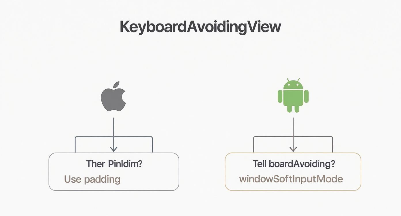
As the diagram shows, there's a fundamental split in how you troubleshoot keyboard issues. iOS usually plays nice with padding adjustments, while Android often requires you to tweak the native windowSoftInputMode settings. When those standard fixes don’t cut it, especially in a complicated UI, that’s your cue to explore more robust alternatives.
When you're aiming for a polished user experience, you can't afford jerky animations or inputs that get buried by the keyboard. This is exactly where third-party packages shine.
Two of the most popular and battle-tested libraries out there are:
ScrollView that automatically scrolls the focused TextInput into view with a silky-smooth animation. It's highly configurable and often just works right out of the box.From my own experience, I'd say react-native-keyboard-aware-scroll-view is a fantastic choice for upgrading existing apps with long forms that are already using a ScrollView. For new projects, especially those with modals or a heavy focus on custom animations, react-native-avoid-softinput is the way to go for its flexibility and performance.
When picking a library, it’s helpful to see how they stack up.
| Library | Ease of Use | Platform Consistency | Best for Complex UI | Performance Impact |
|---|---|---|---|---|
| KeyboardAvoidingView | High | Low | Simple Forms | Low |
| react-native-keyboard-aware-scroll-view | High | Medium | Scrollable Forms | Medium |
| react-native-avoid-softinput | Medium | High | Modals, Bottom Sheets | Low |
| Custom Hook (Keyboard API) | Low | High (with effort) | Any Custom UI | Varies |
Ultimately, the best choice depends on your specific needs, but for most production apps, a dedicated library will save you a ton of headaches.
For developers who crave the ultimate level of control, there's always the option of building a custom solution from scratch. React Native's built-in Keyboard module is a powerful API that gives you listeners for keyboard events like keyboardDidShow and keyboardDidHide.
By tapping into these events, you can write a custom React hook that manually animates your views using the Animated API. This approach puts you in the driver's seat, with complete authority over the animation's timing, easing, and final position.
It’s definitely more work, but it’s the perfect path for achieving those unique, pixel-perfect interactions that pre-built libraries can't offer. For some solid ideas on how to structure these kinds of components, take a look at our guide on building a React Native design system.
The limitations of the core KeyboardAvoidingView have really pushed the community to innovate. As a result, we've seen a clear trend away from a one-size-fits-all component toward specialized libraries and custom hooks.
This shift represents a maturation in how we handle keyboard interactions in React Native. It allows us to build truly polished, production-grade apps that can handle any keyboard scenario flawlessly, no matter how complex the UI gets.
KeyboardAvoidingView QuestionsEven when you follow the book, KeyboardAvoidingView can throw a curveball. Let's tackle some of the most common headaches I've seen pop up time and time again.
This one's a classic. You've got KeyboardAvoidingView set up, but when the keyboard goes away, a huge, ugly gap is left at the bottom of the screen. It’s a tell-tale sign of using behavior="padding" on a screen without a scroll view, especially on iOS.
What happens is the component adds that padding but doesn't always clean up after itself, particularly if you're navigating away or the component's state is changing things around. The simplest, most reliable fix? Just wrap your form content in a ScrollView. It doesn’t even have to be a screen that needs to scroll.
<ScrollView contentContainerStyle={{ flexGrow: 1 }}> <KeyboardAvoidingView behavior="padding" style={{ flex: 1 }}
{/* Your form content */}
This little trick often sorts out that lingering space because the ScrollView gives the KeyboardAvoidingView a much more stable environment to work within.
Yes, but it's often a pain. Using KeyboardAvoidingView inside a standard React Native Modal gets complicated because the modal technically lives in a separate view hierarchy. Because of that, the usual behavior props don't always calculate the keyboard's height and position correctly.
The key is usually to manually set the keyboardVerticalOffset. You'll have to play around with different values to see what feels right for your modal's specific design and position on the screen.
A good starting point for modals is a
keyboardVerticalOffsetof around 50. Tweak it from there. Honestly, if you're doing a lot of work with inputs in modals or bottom sheets, a dedicated library likereact-native-avoid-softinputcan be a lifesaver and a far more robust solution.
By default, KeyboardAvoidingView animates the view into place, which is great for a smooth UX. But sometimes, you might need an instant adjustment to avoid conflicting animations or to match a specific UI pattern.
Unfortunately, there's no simple animation={false} prop to flip. If you really need to kill the animation, you'll have to build a custom component. This means getting your hands dirty with the Keyboard API and React Native's Animated library to create your own logic and set the animation duration to zero. It gives you total control but adds a fair bit of complexity. For most situations, it's best to stick with the default animation—it's there for a reason.
Tired of wrestling with tricky UI components? theappmarket has a huge library of production-ready React Native templates where all the keyboard handling and platform quirks are already solved. Check out our templates and ship your next project in record time.

Dec 08, 2025
4 min read
android login with facebook: Learn to set up the Facebook SDK, manage tokens, and implement secure authentication across native Android, cross-platform apps.

Dec 07, 2025
4 min read
Master the alert in React Native. Learn to handle platform differences, build custom modals, and apply best practices for a seamless user experience.

Dec 05, 2025
4 min read
A practical guide to implementing a React Native PDF viewer. Learn to compare libraries, handle native setup, and troubleshoot common issues with real code.

Dec 04, 2025
4 min read
how to validate startup idea: learn proven methods like customer interviews, MVPs, and metrics to confirm market fit.

Dec 03, 2025
4 min read
how to make app like uber: Learn core features, tech stack, development steps, testing, and launch tips.

Dec 02, 2025
4 min read
Build a rock-solid React Native setup. This guide covers Expo vs. Bare workflows, TypeScript, pnpm monorepos, NativeWind, and deployment strategies.

Dec 01, 2025
4 min read
A practical guide to Stripe React Native integration. Learn to set up your server, build payment UIs, handle webhooks, and launch secure mobile payments.

Nov 30, 2025
4 min read
Learn how to master push notifications in React Native. This guide covers setup, best practices, and advanced techniques for engaging your users.

Nov 29, 2025
4 min read
Build powerful location-based apps with our practical guide to react native with google maps. Get setup guides, pro tips, and best practices for iOS & Android.

Nov 28, 2025
4 min read
Explore deep linking react native with a practical guide to configuring URL schemes, universal links, navigation, and testing for Expo and bare apps.

Nov 28, 2025
4 min read
A practical guide to building a scalable React Native design system. Learn to implement tokens, theming, and tools like NativeWind and gluestack-ui.

Nov 26, 2025
4 min read
Learn why react native expo templates speed up your projects with ready-made patterns and practical tips.

Nov 25, 2025
4 min read
Discover how to improve developer productivity with actionable strategies for workflow, tooling, and culture. A practical guide for software engineering teams.

Nov 24, 2025
4 min read
Discover the best cross platform app development tools. Compare top frameworks like Flutter and React Native to build and ship apps faster.

Nov 23, 2025
4 min read
This Expo React Native tutorial provides a hands-on guide to building cross-platform apps. Learn setup, styling with NativeWind, navigation, and deployment.

Nov 22, 2025
4 min read
Build beautiful UIs faster with this guide to Tailwind CSS React Native. Learn setup, styling, and advanced techniques with NativeWind for mobile apps.

Nov 21, 2025
4 min read
Explore our curated list of 7 top-tier React Native app examples. Discover production-ready templates and resources to build your next app faster.

Mar 19, 2025
4 min read
theappmarket offers React Native UI templates to accelerate development. Get customizable, production-ready React Native app templates and Ui kit, some free. Build faster & smarter today!