Rapid Friday Sale is Live!
Get exclusive discounts on all products
Nov 28, 2025

4 min read


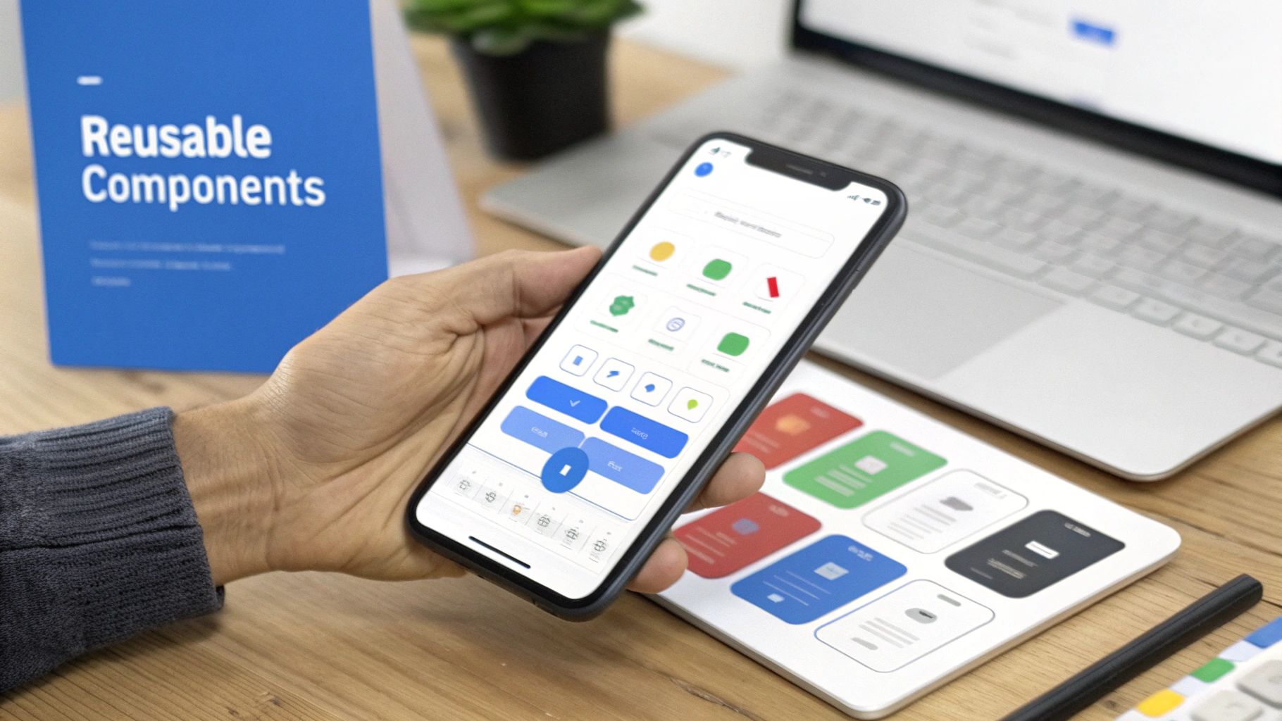
A React Native design system isn't just another component library. Think of it as the single source of truth for your entire mobile app's user interface—the foundational blueprint that keeps everything consistent. It’s what ensures every button, color, and font looks and feels the same across both iOS and Android, which ultimately saves a massive amount of development time.
Before you even think about code, it's important to grasp that a design system is a strategic play, not just a dev task. It fundamentally shifts your team's mindset from building one-off screens to creating a cohesive, reusable ecosystem of components. This simple change helps you dodge the slow creep of UI debt, where small inconsistencies pile up and make future updates a nightmare.
Let me give you a real-world example. Imagine your marketing team wants to update the primary brand color. Without a design system, a developer has to go on a tedious scavenger hunt, manually changing the color value in dozens—or even hundreds—of files. It's slow and incredibly easy to miss something.
But with a design system? You update a single design token. That's it. The change instantly cascades through the entire app, reliably and without any manual effort. This same principle applies to everything from typography and spacing to animations and icons.
This diagram really nails down the core benefits a solid design system brings to the table.

As you can see, it all boils down to shipping features faster, maintaining a unified UI, and getting new team members up to speed with less friction.
To give you a clearer picture of what we'll be building, here's a high-level look at the essential elements that make up our design system. This table acts as a roadmap for the key pillars we'll construct throughout this guide.
| Pillar | What It Does | Core Advantage |
|---|---|---|
| Design Tokens | Centralizes UI values like colors, spacing, and fonts. | Makes global style changes instant and consistent. |
| Component Library | Provides a set of reusable, pre-built UI elements. | Speeds up development and ensures visual consistency. |
| Cross-Platform Theming | Allows for easy switching between themes (e.g., light/dark). | Enhances user experience and brand flexibility. |
| Documentation | Offers clear usage guidelines and examples for the team. | Simplifies onboarding and promotes correct implementation. |
Each of these pillars works together to create a powerful, scalable foundation for any React Native application.
One of the biggest wins you'll see is a massive boost in team velocity. When designers and developers are pulling from the same shared library of approved components, they're suddenly speaking the same language. This cuts out so much of the usual back-and-forth and guesswork.
Instead of debating pixel-perfect implementation details, everyone can focus on what really matters: solving user problems. New developers can also hit the ground running because the system gives them clear rules and a toolbox of ready-to-use building blocks.
A design system is the ultimate enabler for scale. It empowers teams to build consistently and efficiently, ensuring that the first screen looks and feels just like the hundredth.
This component-first approach is just plain efficient. In fact, research shows that React's component architecture can lead to 60% faster development times compared to older, monolithic methods. When you layer on modern tools like TypeScript, you make the developer experience even better with robust type safety and autocompletion.
By investing in a React Native design system upfront, you’re not just building an app; you’re building a resilient foundation that will pay for itself over and over again.
This is the moment where the high-level theory of a React Native design system gets real. We're talking about design tokens: the essential, non-negotiable atoms of your UI. Think of them less as static style values and more as the shared language that finally gets designers and developers on the same page.

It’s the difference between hardcoding a hex code like #007AFF for a button and referencing a token like colors.primary.base. When your brand gets a refresh, you just update that one token, and every single primary button across your app updates instantly. No more find-and-replace nightmares. That’s the magic of a token-based system.
Our mission here is to build an architecture where a single change propagates everywhere automatically.
To keep this system from turning into chaos, we need structure. This is exactly where TypeScript comes in, providing the type safety that saves us from typos and assigning the wrong kinds of values. A well-organized token file is the literal spine of your design system.
The best way to start is by sorting tokens into logical groups based on what they do.
Using TypeScript from the get-go gives you autocompletion in your code editor, which is a massive productivity boost and pretty much eliminates the risk of using a token that doesn't exist.
Design tokens forge a shared vocabulary. When a designer says, "Let's use spacing-4 here," a developer knows precisely what that means because it's a defined constant. This alignment kills ambiguity and makes handoffs ridiculously smooth.
With our tokens defined, we need to make them available across the entire app. This is also our chance to build in support for theming, like the classic light and dark modes. React’s Context API is tailor-made for this, letting us pass theme values down to any component without the headache of prop-drilling.
First, we’ll set up a ThemeContext. This will hold our current theme data, exposing both the active tokens and a function to swap themes on the fly.
Then, we'll build a ThemeProvider component. This provider wraps our entire application, detects the user's system preference (light or dark), and serves up the right set of tokens to every component inside it.
This setup makes theme switching a breeze. A single function call is all it takes to re-render the app with a new set of tokens, instantly transforming the look and feel of every single component.
So, what does this actually look like in a project? You'll typically have a theme directory where you store your token definitions and the context provider.
Your color tokens file might look something like this, with separate objects for your light and dark palettes:
// theme/colors.ts export const lightColors = { primary: '#007AFF', background: '#FFFFFF', text: '#1C1C1E', };
export const darkColors = { primary: '#0A84FF', background: '#000000', text: '#FFFFFF', };
From there, you’d combine these with your spacing and typography tokens into a comprehensive theme object. The final piece of the puzzle is a custom hook, like useTheme(), which lets any component easily tap into these values. This simple hook keeps your component logic clean by hiding the nitty-gritty details of the context consumer.
Alright, you've got your design tokens defined. Now for the fun part: turning those abstract values into the actual building blocks of your UI. This is where we shift from making rules to building tangible, reusable components for our React Native design system. With NativeWind, we can build components that feel right at home on iOS, Android, and even the web.

NativeWind brings the utility-first magic of Tailwind CSS to React Native. Instead of wrestling with separate style objects, we'll apply styles directly in our JSX using those familiar class names. This speeds things up immensely and, more importantly, keeps us honest—it naturally forces us to use the design tokens we just worked so hard to define.
Our goal is a library of rock-solid, composable components—think Buttons, Inputs, and Cards. They need to be flexible, accessible, and smart enough to react to theme changes on their own.
Let's kick things off with the cornerstone of any UI kit: the button. Get this wrong, and you’ll soon be drowning in a sea of one-off variations. The secret is to think in terms of composition. We need to build a flexible base that we can easily extend with variants.
We'll craft a Button component that accepts props for different styles (like primary, secondary, outline) and sizes (sm, md, lg). Behind the scenes, these props will map directly to NativeWind utility classes that pull from our tailwind.config.js file—right where our design tokens are defined.
This connection is everything. When a developer uses a class like bg-primary-500, NativeWind knows to grab the corresponding color token we defined earlier. That means our button will automatically adapt to theme changes, like flipping from light to dark mode, with zero extra code.
A solid structure for our universal button would look something like this:
Pressable core: This handles the fundamental touch interactions and press-state feedback.cva (Class Variance Authority) is perfect for managing style combinations without creating a tangled mess.This composable setup keeps the component API clean and intuitive, and it saves everyone from the headache of prop-drilling.
Next up is the TextInput. Just like our button, we need an input that is visually consistent and, crucially, highly accessible. This means thinking beyond just colors and borders and building in essential accessibility props from the very beginning.
Every input component we build must include props like accessibilityLabel. This gives screen readers a descriptive label, ensuring users with visual impairments know exactly what the input is for.
A design system isn't just about making things look good; it's about making them work for everyone. Building accessibility into your core components from day one is non-negotiable for creating inclusive applications.
When styling our TextInput with NativeWind, we'll lean on our tokenized colors for the border, text, placeholder, and focus states. A focused input, for example, might get a border-primary-500 class, linking it directly to our theme-aware tokens. This guarantees that every input field in the app not only looks the part but also behaves predictably.
The entire React Native ecosystem is moving forward, with tools like NativeWind and Expo leading the charge. A recent survey actually found that 88 percent of developers feel React Native is on the right track, which is a massive vote of confidence. You can read more about developer sentiment on Devclass.com. This momentum makes now the perfect time to be investing in a robust React native design system.
Finally, let's talk about the Card component. Cards are the workhorses of UI, used to group all sorts of content, from product info to user profiles. The key to a truly great card component is flexibility born from composition.
Instead of building a monolithic Card with a dozen props, we'll break it down into smaller, composable pieces that can be mixed and matched:
Card.Root: The main container, styled with base tokens for background color, border-radius, and shadow.Card.Header: A dedicated spot for a title and maybe some action icons.Card.Body: The primary content area, with flexible padding.Card.Footer: An optional slot at the bottom for actions or metadata.This approach empowers developers to construct all kinds of layouts without ever breaking from the system's rules. Each sub-component is styled with NativeWind utilities, ensuring every card—no matter how simple or complex—adheres to our design system's guidelines for spacing, color, and typography. By focusing on this composable architecture, you build a system that encourages creativity while enforcing consistency.
Let’s be honest: building a comprehensive React Native design system from the ground up is a massive project. While it gives you ultimate control, it’s not always the smartest move, especially when you’re trying to ship fast. This is where pre-built UI kits like gluestack-ui come in, offering a powerful middle ground.
Think of it like building a custom home on a pre-poured foundation. The library provides a complete set of accessible, production-ready components—buttons, inputs, modals—and you get to focus on applying your unique brand identity right on top. This strategy is all about smart acceleration, not compromise.
The real win here is the immediate jump in development velocity. You're not spending weeks wrestling with a button to make it work flawlessly on both iOS and Android; you get one that just works, right out of the box. Your team can redirect that effort toward customizing these components with your carefully crafted design tokens.
This approach gives you the speed of a library combined with the brand consistency of a bespoke system. It’s perfect for teams that need to move quickly without racking up a ton of UI debt down the line. The demand for these kinds of solutions is exploding; the global React Native app development market hit USD 325 million in 2024 and is on track to reach USD 499 million by 2031, largely driven by this need for a faster time-to-market. You can dig into the market's expansion on intelmarketresearch.com.
So, how do you actually take a generic Button from a library and make it your button? The secret is to strategically override the library's default theme with your own design tokens. Modern UI kits like gluestack-ui are built for this, exposing a theme configuration file that you can easily extend.
Let’s say your brand’s primary action color is a specific shade of blue and you use a unique font like "Inter". Adapting the library would look something like this:
gluestack-ui.config.ts).For example, you might replace the default primary.500 color with your brand’s #3A47FF hex code. Just like that, any component in the library that references primary.500 will automatically use your brand color. It's a clean, scalable way to enforce consistency across dozens of components.
The goal isn't to fight the UI kit; it's to work with it. A well-designed library provides clear extension points. Your job is to find those points and inject your brand's DNA without breaking the underlying component logic.
Let's walk through a classic scenario: customizing a gluestack-ui Button to match your design system. The default button might have padding, font weight, and a border-radius that just don't vibe with your brand guidelines.
You can create a custom variant or simply override the base styles directly in the configuration file.
Here's how you'd tackle it:
Button component's style definitions.borderRadius to match your system's radii.md token.<Button variant="premium">.This level of control ensures that even though you started with a generic library, the final product feels entirely custom-built. By using templates and UI kits from places like The App Market, you can get a massive head start. They often come pre-configured with modern tools like TypeScript and NativeWind, ready for you to add your brand’s personal touch.
A pile of components isn't a design system. It only becomes one when it’s properly documented, thoroughly tested, and actually trusted by your team.
Without that foundation, even the most beautiful component library will crumble as your app scales. This is where you turn a folder of code into a reliable, shared resource that everyone can depend on.
Think of documentation as the instruction manual. If a developer can’t quickly figure out which component to use or how its props work, they’ll just build their own one-off version. That single act defeats the whole purpose of the system, bringing back the exact inconsistencies you were trying to fix.
The best documentation isn't static—it's interactive. This is where a tool like Storybook is an absolute game-changer for React Native projects. It gives you an isolated workshop to showcase every single component, completely separate from your main application.
Storybook becomes a live, interactive catalog. Developers can see, touch, and poke at components to understand how they work without needing to spin up the entire app.
You create "stories" for each component to demonstrate all its different states and variations.
Button look like straight out of the box?primary, secondary, and outline versions all lined up.Input field appear to the user?Card behave when you stuff it with a ridiculously long paragraph?Seeing is believing. This kind of visual context is miles more effective than a dry wall of text. It lets developers and designers instantly confirm that a component looks and behaves exactly as expected in every conceivable scenario, dramatically improving team alignment.
A design system that’s hard to use won’t get used. Storybook turns your component library from a black box into a playground, making it the path of least resistance for every developer on your team.
Documentation builds trust, but testing proves it. A solid testing strategy is your guarantee that the design system will remain stable and predictable, no matter who’s making changes. For a React Native design system, that means combining two types of testing to get the best coverage.
We really need to verify two things: that the components function correctly and that they look correct.
When it comes to functional testing, the dream team is Jest and the React Native Testing Library. This combo is the industry standard for a reason. It lets you test your components from the user’s point of view, which is what really matters.
Instead of getting bogged down in implementation details, you write tests that mimic how a user would actually interact with the UI.
For a simple Button component, your tests should answer questions like:
onPress function actually fire when someone taps it?disabled prop is true, does it correctly block press events?This approach ensures your components don't just look pretty—they’re functionally solid and accessible. It gives your team the confidence to pull components off the shelf without worrying they're introducing subtle bugs.
Functional tests are crucial, but they’re blind to visual changes. A developer could accidentally tweak a margin or change a font weight, and all your unit tests would still pass with flying colors. This is the exact problem snapshot testing was designed to solve.
The first time you run a snapshot test, Jest takes a "picture" of your component's rendered output and saves it as a file. The next time you run the tests, it takes a new picture and compares it to the old one. If anything has changed—even by a single pixel—the test fails.
This incredibly simple technique is a powerful safety net against visual regressions. It's especially vital in a design system, where one tiny CSS change to a core component can create a massive, unintended ripple effect across dozens of screens. While it's not a full-blown visual regression tool, it provides an excellent baseline for maintaining visual consistency in your React Native project.
When teams first start talking about building or adopting a React Native design system, the same questions always pop up. Getting through these early conversations is crucial for making sure the system actually helps you, rather than becoming another source of headaches. Let’s tackle some of the most common ones I hear.
https://www.youtube.com/embed/n3LJP9S7xxs
One of the first concerns is always about the time commitment. And yes, building a solid design system takes real effort upfront. But think of it as an investment. That initial work pays for itself over and over again by cutting down the hours you'd otherwise spend on redundant UI tweaks and fixing frustrating inconsistencies.
It’s going to happen. You'll hit a unique feature or a screen that needs something that just doesn't fit the current system. The knee-jerk reaction is to build a one-off component and move on, but that's a slippery slope to UI debt.
Before you go rogue, ask yourself: can this be built by composing existing primitives from our system? More often than not, the answer is yes.
If you genuinely need something new, build it as if it were a core system component from day one. That means giving it variants, thinking through accessibility props, and documenting it properly. This "system-first" mentality ensures that even your exceptions are built with an eye toward future reuse.
The real challenge of a design system isn't building the components; it's fostering the discipline to use and evolve it consistently. Every "exception" should be treated as a potential addition, not a deviation.
Ah, the classic build-versus-buy debate. Going from scratch gives you total control, but it’s a massive undertaking. On the other hand, using an open-source library like gluestack-ui can get you moving in a fraction of the time, but you have to play by its rules.
From my experience, a hybrid approach is usually the sweet spot:
This strategy gives you the best of both worlds. You get the speed of a pre-built foundation without sacrificing your unique brand identity, letting you focus your energy where it delivers the most value.
This is the big one. Keeping the Figma files aligned with the coded components is a constant battle. When communication breaks down here, inconsistencies creep in and multiply.
The most effective solution I've seen is to make the design system's codebase the undisputed single source of truth.
To make this work, teams often use a tool like Storybook as more than just a dev playground. It becomes a shared reference point for everyone—designers, PMs, and developers. When Storybook is the official record of what a component looks like and how it behaves, there's no more room for guesswork. Pairing this with regular sync meetings to review changes and new additions is the key to keeping everyone on the same page. This shared understanding is the bedrock of an effective React Native design system.
Ready to ship your mobile app faster with a production-ready foundation? theappmarket offers a curated selection of premium React Native templates and UI kits built with Expo, TypeScript, and NativeWind. Explore our catalog and launch your project with confidence.

Dec 08, 2025
4 min read
android login with facebook: Learn to set up the Facebook SDK, manage tokens, and implement secure authentication across native Android, cross-platform apps.

Dec 07, 2025
4 min read
Master the alert in React Native. Learn to handle platform differences, build custom modals, and apply best practices for a seamless user experience.
Dec 06, 2025
4 min read
keyboardavoidingview react native: Master keyboard handling with KeyboardAvoidingView across iOS, Android, Expo, and TypeScript.

Dec 05, 2025
4 min read
A practical guide to implementing a React Native PDF viewer. Learn to compare libraries, handle native setup, and troubleshoot common issues with real code.

Dec 04, 2025
4 min read
how to validate startup idea: learn proven methods like customer interviews, MVPs, and metrics to confirm market fit.

Dec 03, 2025
4 min read
how to make app like uber: Learn core features, tech stack, development steps, testing, and launch tips.

Dec 02, 2025
4 min read
Build a rock-solid React Native setup. This guide covers Expo vs. Bare workflows, TypeScript, pnpm monorepos, NativeWind, and deployment strategies.

Dec 01, 2025
4 min read
A practical guide to Stripe React Native integration. Learn to set up your server, build payment UIs, handle webhooks, and launch secure mobile payments.

Nov 30, 2025
4 min read
Learn how to master push notifications in React Native. This guide covers setup, best practices, and advanced techniques for engaging your users.

Nov 29, 2025
4 min read
Build powerful location-based apps with our practical guide to react native with google maps. Get setup guides, pro tips, and best practices for iOS & Android.

Nov 28, 2025
4 min read
Explore deep linking react native with a practical guide to configuring URL schemes, universal links, navigation, and testing for Expo and bare apps.

Nov 26, 2025
4 min read
Learn why react native expo templates speed up your projects with ready-made patterns and practical tips.

Nov 25, 2025
4 min read
Discover how to improve developer productivity with actionable strategies for workflow, tooling, and culture. A practical guide for software engineering teams.

Nov 24, 2025
4 min read
Discover the best cross platform app development tools. Compare top frameworks like Flutter and React Native to build and ship apps faster.

Nov 23, 2025
4 min read
This Expo React Native tutorial provides a hands-on guide to building cross-platform apps. Learn setup, styling with NativeWind, navigation, and deployment.

Nov 22, 2025
4 min read
Build beautiful UIs faster with this guide to Tailwind CSS React Native. Learn setup, styling, and advanced techniques with NativeWind for mobile apps.

Nov 21, 2025
4 min read
Explore our curated list of 7 top-tier React Native app examples. Discover production-ready templates and resources to build your next app faster.
Mar 19, 2025
4 min read
theappmarket offers React Native UI templates to accelerate development. Get customizable, production-ready React Native app templates and Ui kit, some free. Build faster & smarter today!