Rapid Friday Sale is Live!
Get exclusive discounts on all products
Dec 12, 2025

4 min read


When it comes to picking the best React Native component library, the conversation often circles back to a few key players. You've got React Native Paper for its pure Material Design implementation, Tamagui for pushing the boundaries on performance, and gluestack-ui for its incredibly flexible, Tailwind-like styling. Ultimately, the right choice really boils down to your project's DNA—whether you need strict design adherence, raw speed, or total creative freedom.

Choosing a component library isn't just a technical checkbox; it's a strategic commitment that will shape your app's entire lifecycle. A great library acts as a launchpad, accelerating development and guaranteeing a consistent, polished user experience. Pick the wrong one, and you're signing up for a future of technical debt, painful maintenance, and a UI that feels cobbled together.
This single decision echoes through your entire workflow, from the first design mockup to how you scale your app years down the road. It’s the very foundation of your UI, and it dictates how fast you can ship new features and adapt to evolving design trends. The market for these tools is booming for a reason.
The component libraries software market is on a massive growth trajectory, projected to climb from USD 3.8 billion in 2024 to an incredible USD 12.4 billion by 2033. The UI Component Libraries segment is the engine driving this growth, commanding a 45% market share back in 2023. This isn't just a niche tool; it's the backbone of modern app development. You can dive deeper into the data about the component libraries market and its projected growth.
Making the right call means you need a clear-eyed set of criteria. It’s not enough to just scan a feature list. You have to understand the trade-offs and see if a library's core philosophy actually gels with your team’s goals. We're going to break down each option based on the factors that truly matter.
Here are the pillars we'll use for our analysis:
A component library isn’t just a collection of buttons and modals; it’s an opinionated framework that shapes your development practices. The right one acts as a force multiplier for your team, while the wrong one creates friction at every turn.
Getting a grip on these criteria is everything. For an app where initial load time is king, a library with a minimal bundle size is non-negotiable. On the other hand, if your project has a highly bespoke design system, you'll need a powerful theming engine to pull it off.
This guide will give you the tools to analyze these libraries like a seasoned pro, moving way beyond surface-level comparisons. By the end, you’ll have a solid framework for choosing the best react native component library that not only solves today’s problems but also supports your app for the long haul. Let's get into some real, context-driven comparisons.
Picking the right component library isn't just about grabbing the one with the most stars on GitHub. To make a smart choice, you need a solid framework for evaluation. I'm not here to just list features; I want to dig into the real-world impact each library will have on your project and your sanity.
This is the exact lens through which I analyze every library. These aren't just technical benchmarks; they're the critical decision points that can make or break your app's success, from its first launch to its long-term health.
<iframe width="100%" style="aspect-ratio: 16 / 9;" src="https://www.youtube.com/embed/kh-QOXuwywg" frameborder="0" allow="autoplay; encrypted-media" allowfullscreen></iframe>In the mobile world, performance is everything. A component library is a direct dependency that adds to your app's bundle size—the total code a user's phone has to download and process. A bloated bundle means a slower startup, and a slow startup is one of the fastest ways to lose a user.
I always look at how a library handles optimization. Does it support tree-shaking to strip out unused code? Does it offer a Babel plugin to shrink its footprint, like React Native Paper does? A library that's conscious of its weight shows a commitment to a great user experience, which puts it at the top of my list.
A good component library should speed you up, not box you in. Your app needs to reflect your brand, not the library's default styles. That’s why the flexibility of the theming system is a huge deal.
How easily can you set up global styles for colors, fonts, and spacing using a theme provider? What about overriding styles for a single, one-off component? Libraries like UI Kitten, which is built on the Eva Design System, knock this out of the park. A powerful theming API is what separates a generic-looking app from a polished, professional product.
A library's true value isn't just in the components it provides, but in how easily it lets you make those components your own. The goal is to build your app, not the library's demo app.
The whole promise of React Native is to build a consistent app for both iOS and Android from one codebase. A component library has to honor that promise. I look for components that not only look and feel right on each platform but also respect their unique design languages.
This is more than just aesthetics. It’s about interaction. Does the library automatically handle ripple effects on Android and highlight effects on iOS? Solid platform parity means you can deliver a predictable, high-quality experience on any device. For anyone just getting their feet wet, nailing this is crucial, and it all starts with a proper React Native setup.
Modern app development runs on good tooling, and TypeScript is at the top of that list. I put a heavy emphasis on libraries with first-class, out-of-the-box TypeScript support. Good type definitions mean you get auto-completion, catch bugs before you even run your code, and have a self-documenting API. A library without solid TS support is just asking for trouble.
The overall developer experience is just as important. This includes the quality of the documentation, how clear the API is, and whether it plays nicely with Expo. A library with clean docs, practical examples, and a smooth setup process will save you hours of headaches. That alone makes it a winner in my book.

Okay, now that we know how to judge a library, let's get our hands dirty and put the big names to the test. We're going to move past the marketing fluff and look at the real-world trade-offs you'll face with four of the most popular choices.
This isn't just about what features they have; it's about the philosophy behind them and what it actually feels like to build with them day-to-day. We'll be looking at React Native Paper, React Native Elements, UI Kitten, and the performance-obsessed Tamagui. Each one has a totally different take on how you should build a UI.
By the way, if you want a more foundational overview of UI elements in general, this practical guide to React Native UI components is a solid read. It's a great primer before you commit to a full-blown library.
Here’s a quick-glance table to help you compare these libraries side-by-side. Think of this as your cheat sheet for making a fast, informed decision based on what matters most to your project.
| Library | Primary Design System | Theming Flexibility | Performance Focus | Expo Support | Best For |
|---|---|---|---|---|---|
| React Native Paper | Material Design | Moderate | Good (Babel plugin) | ✅ Excellent | Teams all-in on Material Design for a native Android look. |
| React Native Elements | Agnostic | High | Standard | ✅ Excellent | Developers who want total style control and a solid foundation. |
| UI Kitten | Eva Design System | Very High | Standard | ✅ Excellent | Apps that need deep, dynamic theming and custom branding. |
| Tamagui | Agnostic (Unstyled Core) | Very High | Excellent (Compiler) | ✅ Excellent | Performance-critical apps and unifying web/mobile codebases. |
This table gives you the high-level summary, but the real story is in the details of how each library operates and the unique problems it solves.
If your team lives and breathes Google's Material Design, just stop here and go with React Native Paper. Developed by the pros at Callstack, this library isn't just inspired by Material Design—it's a pixel-perfect, faithful implementation.
Working with Paper feels incredibly consistent and predictable. When your designer hands you a mockup that follows Material guidelines, you can translate it into code almost one-to-one, which is a massive time-saver. Plus, it comes with accessibility and theming (light and dark modes) baked right in, so you get a lot of wins straight out of the box.
They even have a Babel plugin that automatically tree-shakes unused components, helping to keep your final bundle size in check. It's a thoughtful touch that shows a real commitment to performance.
But here's the catch: its biggest strength is also its biggest weakness. If your brand identity needs to break free from the Material mold, you’re going to be fighting the library. While theming is supported, trying to stray too far from its core principles feels like swimming upstream.
Key Differentiator: React Native Paper is for teams that want to adopt Material Design as a complete system, not just a stylistic suggestion. It prioritizes consistency and adherence to platform standards above all else.
React Native Elements takes the opposite approach. It’s less of a prescriptive design system and more of a structural toolkit. Think of it as a box of well-made, foundational Lego pieces—buttons, cards, lists—that don’t have a strong stylistic opinion.
This philosophy is all about developer freedom. You’re not locked into Material or any other design language, making it a fantastic starting point for apps with a completely bespoke UI. Customization is straightforward, relying on a mix of custom props and the standard React Native style prop you already know.
The trade-off? All that freedom means you’re on the hook for creating and enforcing your own design language. While it has a ThemeProvider, the theming system isn't nearly as robust as what you'll find in UI Kitten or Paper. It’s on you to make sure everything looks consistent.
As one of the oldest and most trusted libraries in the ecosystem, it has a huge community and fantastic documentation. It’s a great pick if you want to skip writing boilerplate but still hold the reins on your app's final look and feel.
If your top priority is deep, dynamic customization, you need to look at UI Kitten. Built around the Eva Design System, its entire architecture is designed for theming. This library makes it ridiculously easy to define and manage a comprehensive design system with custom colors, typography, and component styles.
UI Kitten's killer feature is its ability to swap themes in real-time without an app reload. It ships with light and dark themes, but its real power is in how easily you can extend them or create entirely new ones. For a deeper dive into its capabilities, check out the official documentation for UI Kitten.
Another huge plus is its first-class support for right-to-left (RTL) languages. For anyone building a global app, this is a lifesaver. The components are designed to flip automatically for RTL layouts, saving you a mountain of work.
The learning curve can be a little steeper, as you really need to grasp the Eva Design System to unlock its full potential. But for any project that needs a truly unique and consistent brand presence, that initial time investment pays off big time.
Tamagui isn't just another component library; it's a full-blown UI toolkit with its own optimizing compiler. Its entire reason for being is to squeeze every last drop of performance out of your app on both mobile and web.
It pulls this off with a slick "ahead-of-time" compilation strategy. Instead of processing styles at runtime, Tamagui flattens your component tree and generates hyper-optimized, platform-specific code during the build process. The result is faster rendering, smaller bundles, and a snappier app.
You get a set of unstyled, accessible core components that you can style using a system that feels a lot like a utility-first CSS framework. This gives you the best of both worlds: the freedom to build your own design system from scratch and the performance benefits of its compiler.
Key Differentiator: Tamagui's optimizing compiler is its secret sauce. It's built for projects where performance is non-negotiable and where a unified codebase for web and mobile is a primary goal.
The main thing to consider is that Tamagui is still relatively new, and its compiler introduces a different way of thinking about styling in React Native. But if your team is willing to embrace its philosophy, the performance gains are massive, making it a top contender for the best React Native component library for truly ambitious projects.
Picking the right React Native component library is just the start. The real magic happens when you start bending its components to fit your unique brand identity. Pre-built elements are a fantastic launchpad, but they should serve your design, not the other way around.
This is where smart integration and advanced styling come in. You know you’ve adopted a library successfully when you can override its defaults without fighting the framework. Instead of seeing components as rigid, black-box elements, think of them as flexible foundations for your own creativity. The goal is to make the library feel like a natural extension of your codebase.
Getting this right is what makes an app feel cohesive and professional. When every button, card, and modal perfectly reflects your brand, the user experience just clicks. For a deeper dive into creating this level of consistency, check out our guide on building a complete React Native design system.
One of the sharpest workflows I've seen involves pairing a component library with a utility-first CSS framework. A tool like NativeWind brings the developer-friendly power of Tailwind CSS straight into the React Native world, and this combo can seriously speed things up.
Forget writing custom stylesheets or messy inline style objects for every little tweak. You can just apply utility classes directly to library components. This keeps your styling logic right there with your markup, making your code so much easier to read and maintain down the line.
For instance, you could grab a generic <Button> from a library and give it a custom look in seconds:
import { Button } from 'react-native-paper'; import { styled } from 'nativewind';
const StyledButton = styled(Button);
const CustomButton = () => ( <StyledButton mode="contained" className="bg-blue-500 rounded-full py-2 px-6 shadow-lg" labelClassName="text-white font-bold text-lg"
Get Started
This approach gives you fine-grained control without the verbose boilerplate of traditional styling. It’s the best of both worlds: the structure of a component library blended with the speed of a utility-first framework.
Another powerful strategy centers on universal libraries like gluestack-ui. These are built from the ground up to be headless and unstyled. They provide all the accessible, feature-rich component logic you need, leaving you free to style them however you want.
You can use a library like gluestack-ui in a couple of ways:
Think of component libraries as interoperable tools, not walled gardens. The best toolkit for your project is often a strategic mix of several libraries that play well together.
No matter which library you go with, you'll eventually need to create a custom version of a component. The cleanest way to handle this is to wrap the library component inside one of your own. It's a simple pattern that promotes reusability and keeps your styling logic contained.
Instead of plastering the same overrides all over your app, create a new component that does it for you. This keeps your application code clean and ensures every instance of your custom component looks and behaves consistently. Plus, it makes future design updates way easier—you only have to change the style in one place.
Okay, we've broken down the details, but turning that analysis into a real-world decision is what matters. Picking the right React Native component library isn't about finding the "best" one—it's about finding the best one for your project. Your goals, your team's skills, and the experience you want to create for your users will dictate the right path.
It really boils down to your philosophy on styling. Are you all-in on a library's design system? Do you want the flexibility of a utility-first framework like Tailwind? Or do you need something totally style-agnostic? This decision tree lays out the main routes developers usually take.
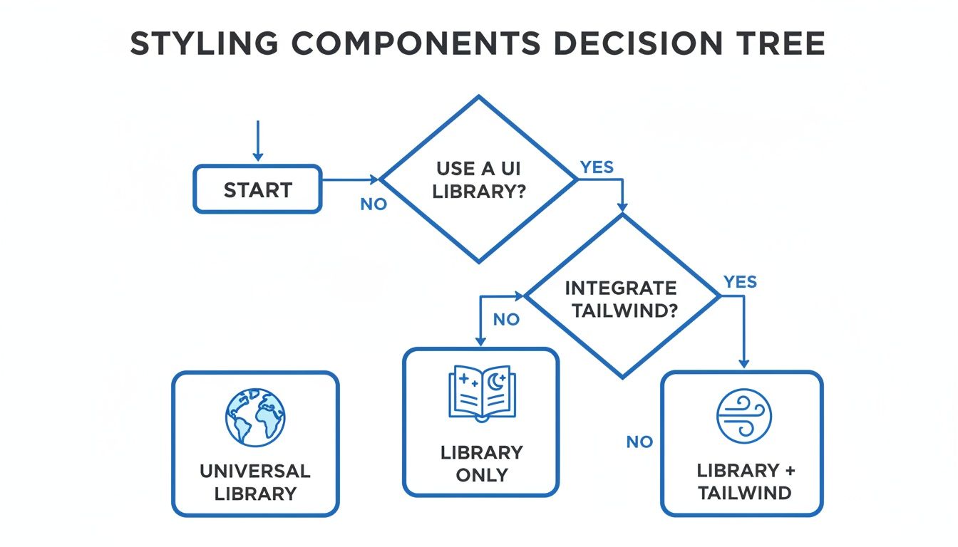
As you can see, modern styling isn't a one-size-fits-all game. It’s about choosing the right tool—or combination of tools—for the job.
Choose React Native Paper if: You need to build an app that looks and feels like it belongs on Android, with pixel-perfect alignment to Google's Material Design. It’s the clear winner when you need to lean into established design patterns and consistency, especially if your team is already familiar with the Material ecosystem. The components are solid, accessible, and ready for production right out of the box.
Just be warned: if your brand has a highly custom or unique visual identity, you might feel boxed in. While its theming is solid, trying to stray too far from Material guidelines will feel like swimming upstream.
Choose Tamagui if: Performance is non-negotiable, particularly if you're building for both mobile and web. Tamagui's ahead-of-time compiler is its secret weapon, flattening style code during the build process to deliver faster renders and smaller bundles. For ambitious, performance-critical apps where every millisecond is scrutinized, this is your best bet.
The trade-off? It’s a newer player, and there's a learning curve. To really unlock its power, your team has to embrace its compiler-first approach to styling.
A library's true fit is revealed when its core philosophy matches your project's primary objective. For a quick MVP, a feature-rich library is perfect. For a high-performance scalable app, an optimized, unstyled core might be better.
Choose UI Kitten if: Your app is built around a bespoke design system and needs a powerful, dynamic theming engine. It's built on the Eva Design System, which makes it incredibly good at creating and switching between complex themes—think light and dark modes on steroids. It's the perfect match for brand-centric apps that need to stand out with a unique visual identity.
On the flip side, UI Kitten can be overkill for simpler projects. The initial setup requires you to get comfortable with its design system principles, so it comes with a steeper learning curve than more straightforward options.
This kind of situational choice is what defines the React Native ecosystem. The framework's massive popularity is undeniable—43,149 firms are actively using it. Its appeal stretches from small startups (over 50% have fewer than 50 employees) to huge enterprises, all contributing to over 2.8 million weekly NPM downloads for its core packages. You can learn more about React Native's market presence on enlyft.com. This enormous user base is exactly why we have so many specialized libraries, each designed to tackle a different kind of project.
As you make your way through the React Native ecosystem, you'll hit a fork in the road that goes beyond just comparing libraries. It’s a bigger strategic call: do you stick with a free, open-source component library, or do you invest in a premium UI kit? Getting this right is key to making sure your tech choices actually line up with your business goals.
Component libraries are the backbone of the community. They give you incredible flexibility, a huge network of support on forums and GitHub, and they don't cost a dime. This route lets you build a totally unique app from the ground up, one component at a time. The flip side? That freedom costs you time and effort. You're on the hook for all the integration, styling, and making sure every piece plays nicely together.
Then you have premium UI kits. Think of these as comprehensive, often beautifully designed sets of screens and components, all packaged and sold as a product. Their biggest selling point is speed. Instead of building from scratch, you get a production-ready foundation that can easily shave weeks—or even months—off your development timeline. For startups or teams trying to get an MVP out the door, that’s a massive advantage.
A UI kit is an accelerator. It trades the granular control of a component library for the immediate velocity of a pre-built, cohesive application structure. The right choice depends entirely on whether your project's biggest constraint is time or the need for a completely bespoke identity.
Of course, this speed comes with its own set of trade-offs. Premium kits have an upfront cost and can sometimes feel a bit rigid. Trying to customize them far beyond their original design can be a real headache, often more difficult than styling a flexible open-source component. You're essentially buying into a specific design philosophy.
For a much deeper dive into this dynamic, check out our guide on choosing the right React Native UI kit. It offers a really comprehensive breakdown.
So, how do you decide? It really comes down to a few key variables for your project.
Getting a handle on the broader world of user interface design frameworks can help put all this into perspective. At the end of the day, there’s no single "best" answer. The right choice is the one that best serves your project’s immediate needs and long-term vision, striking the right balance between speed, cost, and creative freedom.
Picking a React Native component library is a big decision, but the questions don't stop once you've chosen. Let's tackle some of the most common things developers ask when they start integrating a library into their workflow.
Technically, yes, but you probably shouldn’t. While it's possible to mix and match, every library you add increases your app's final bundle size, which can make that first load feel sluggish.
The bigger issue is visual chaos. Different libraries have their own design philosophies, and mixing them often creates a disjointed UI that just feels... off. It's much better to stick with one primary library. Only pull in a second one if it offers a make-or-break component you can't find anywhere else, and be ready for the maintenance headache that comes with it.
Performance hits typically come from two places: the library's bundle size and how its components render. A library with a massive JavaScript footprint means more code for the user to download and parse before your app even becomes interactive.
Beyond that, poorly optimized components can cause a cascade of unnecessary re-renders or create overly complex view hierarchies, making screen transitions feel clunky.
This is exactly what modern libraries like Tamagui are designed to fix. It uses advanced compiler optimizations to flatten styles and slash the amount of work done at runtime. Still, it's always smart to do your own performance analysis before you go all-in on any library.
This is a big one for keeping your app healthy and secure long-term. Always, always read the release notes before you upgrade, especially for a major version jump (like going from v4.x to v5.x). That's where the breaking changes hide.
The best way to handle an update is to do it incrementally on a separate development branch. This gives you a safe space to test everything thoroughly without blowing up your main codebase. Staying reasonably up-to-date is worth the effort—you get the latest bug fixes, security patches, and new features that keep your app feeling modern and stable.
Ready to skip the setup and get straight to building? theappmarket offers a curated marketplace of premium React Native templates and UI kits to help you ship beautiful, production-ready apps in record time. Check out our collection at https://theappmarket.io.

Dec 14, 2025
4 min read
Find the perfect React Native UI library for your project. This guide compares top libraries, selection criteria, and customization strategies.

Dec 13, 2025
4 min read
Learn how to change app name in React Native and Expo. Our guide covers display names, bundle IDs, and store listings for iOS and Android projects.

Dec 11, 2025
4 min read
Discover how to choose the right React Native UI kit. This guide covers top kits, selection criteria, and customization to accelerate your app development.

Dec 10, 2025
4 min read
Explore our in-depth guide to find the best React Native UI library. We compare top contenders to help you choose the right fit for your project.

Dec 09, 2025
4 min read
Discover a practical approach to building apps with React Native. This guide covers setup, UI, state management, and testing to help you ship great apps.

Dec 08, 2025
4 min read
android login with facebook: Learn to set up the Facebook SDK, manage tokens, and implement secure authentication across native Android, cross-platform apps.

Dec 07, 2025
4 min read
Master the alert in React Native. Learn to handle platform differences, build custom modals, and apply best practices for a seamless user experience.
Dec 06, 2025
4 min read
keyboardavoidingview react native: Master keyboard handling with KeyboardAvoidingView across iOS, Android, Expo, and TypeScript.

Dec 05, 2025
4 min read
A practical guide to implementing a React Native PDF viewer. Learn to compare libraries, handle native setup, and troubleshoot common issues with real code.

Dec 04, 2025
4 min read
how to validate startup idea: learn proven methods like customer interviews, MVPs, and metrics to confirm market fit.

Dec 03, 2025
4 min read
how to make app like uber: Learn core features, tech stack, development steps, testing, and launch tips.

Dec 02, 2025
4 min read
Build a rock-solid React Native setup. This guide covers Expo vs. Bare workflows, TypeScript, pnpm monorepos, NativeWind, and deployment strategies.

Dec 01, 2025
4 min read
A practical guide to Stripe React Native integration. Learn to set up your server, build payment UIs, handle webhooks, and launch secure mobile payments.

Nov 30, 2025
4 min read
Learn how to master push notifications in React Native. This guide covers setup, best practices, and advanced techniques for engaging your users.

Nov 29, 2025
4 min read
Build powerful location-based apps with our practical guide to react native with google maps. Get setup guides, pro tips, and best practices for iOS & Android.

Nov 28, 2025
4 min read
Explore deep linking react native with a practical guide to configuring URL schemes, universal links, navigation, and testing for Expo and bare apps.

Nov 28, 2025
4 min read
A practical guide to building a scalable React Native design system. Learn to implement tokens, theming, and tools like NativeWind and gluestack-ui.

Nov 26, 2025
4 min read
Learn why react native expo templates speed up your projects with ready-made patterns and practical tips.

Nov 25, 2025
4 min read
Discover how to improve developer productivity with actionable strategies for workflow, tooling, and culture. A practical guide for software engineering teams.

Nov 24, 2025
4 min read
Discover the best cross platform app development tools. Compare top frameworks like Flutter and React Native to build and ship apps faster.

Nov 23, 2025
4 min read
This Expo React Native tutorial provides a hands-on guide to building cross-platform apps. Learn setup, styling with NativeWind, navigation, and deployment.

Nov 22, 2025
4 min read
Build beautiful UIs faster with this guide to Tailwind CSS React Native. Learn setup, styling, and advanced techniques with NativeWind for mobile apps.

Nov 21, 2025
4 min read
Explore our curated list of 7 top-tier React Native app examples. Discover production-ready templates and resources to build your next app faster.

Mar 19, 2025
4 min read
theappmarket offers React Native UI templates to accelerate development. Get customizable, production-ready React Native app templates and Ui kit, some free. Build faster & smarter today!