Rapid Friday Sale is Live!
Get exclusive discounts on all products
Dec 15, 2025

4 min read

So, what exactly is a React Native component library?
Think of it as a professional-grade toolkit for building your app's interface. Instead of crafting every button, modal, and navigation bar from scratch, you get a collection of pre-built, reusable UI elements. It’s the difference between milling your own lumber for a construction project and having a full set of high-quality, pre-cut building materials ready to go.
This approach lets you assemble your app's screens quickly and confidently, ensuring everything looks and feels consistent right out of the box.
Imagine you’re building a house. You wouldn't smelt your own steel for nails or fire your own bricks, would you? Of course not. You’d use standardized, reliable parts to build a solid home efficiently. A React Native component library is exactly that for mobile app development. It provides all the foundational UI pieces your team needs, already tested and good to go.
This solves one of the oldest problems in software development: reinventing the wheel. Without a library, teams burn countless hours building basic UI elements that offer zero unique value to their users. Every new button or form field becomes a tiny project on its own, eating up time and energy that should be going into your app's core features.
The moment you adopt a component library, you’ll feel the difference. These toolkits are designed to bring order and speed to your workflow from day one.
To put it in perspective, here’s a quick look at the core benefits your team gains by adopting a React Native component library.
| Benefit | Impact on Development | Example |
|---|---|---|
| Speed & Efficiency | Drastically cuts down the time spent on UI development, freeing up engineers to focus on business logic. | Instead of spending a day building a custom date picker, you import a ready-made one and have it working in minutes. |
| Design Consistency | Ensures a uniform look and feel across the entire application, strengthening brand identity. | Every "primary" button in your app—from the login screen to the checkout page—looks and behaves identically. |
| Easier Maintenance | Centralizes UI code, making updates, bug fixes, and redesigns much simpler to implement. | When your brand's main color changes, you update one theme file, and every component in the app reflects the new color. |
| Improved Collaboration | Creates a shared language and toolkit for designers and developers, reducing friction and misunderstandings. | A designer can hand off a mockup using components like "Card" and "Avatar," and the developer knows exactly what to implement. |
In short, a good library becomes the backbone of a smooth and efficient development process.
Relying on these toolkits isn't just a passing trend—it’s a fundamental shift in how modern apps get built. The global component libraries software market hit around USD 3.8 billion in 2024 and is expected to rocket to about USD 12.4 billion by 2033. A huge part of this growth is fueled by cross-platform frameworks like React Native, which saw an 85% jump in the adoption of mobile-first libraries. You can dig into more of these market insights on datahorizzonresearch.com.
A great component library isn't just a collection of code—it's a shared language between designers and developers. It translates abstract design concepts into tangible, functional building blocks, closing the gap and creating a more collaborative, efficient workflow.
Ultimately, a React Native component library gets your team out of the business of building tedious, foundational UI. It lets you focus on what actually matters: creating a killer experience for your users.
Sooner or later, every development team hits a fork in the road. Do you build a custom component library from the ground up, or do you grab a pre-built one off the shelf? This isn't just a coding question—it's a strategic decision that ripples through your budget, timeline, and the entire product roadmap.
Getting this choice right is everything.
Building your own library is like having a custom engine built for a race car. You get total control over every nut and bolt, ensuring it’s a perfect match for your brand’s unique feel and features. But this route demands a serious upfront investment of time, expertise, and cash. And that’s before you even think about the ongoing grind of maintenance, bug fixes, and documentation.
On the other hand, adopting an open-source library is like dropping a battle-tested engine straight off the production line into your car. It gets you moving immediately. You get reliable, well-documented components that slash your time to market. The trade-off? You might bump into customization limits, have to deal with licensing, or work around the library's specific opinions and architecture.
This decision tree gives you a great visual for the key questions that will point you in the right direction.
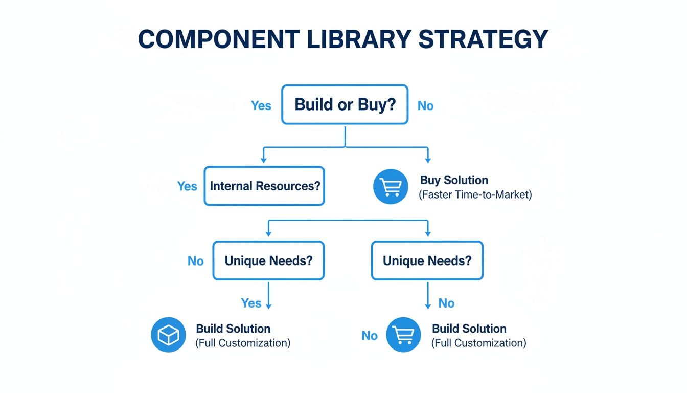
As you can see, the choice really boils down to your team’s size, the project’s complexity, and how tight your deadlines are. Let's dig into what that really means.
Rolling your own React Native component library is a huge commitment, but in certain situations, it’s absolutely the right call. You should seriously consider this path if your project ticks a few of these boxes:
Building your own system is an investment in a core business asset. It pays off big time in brand consistency and developer happiness down the road, but only if you have the resources to keep it alive. This is where a lot of teams get into trouble, completely underestimating the hidden costs of upkeep.
The real cost of a custom-built library isn't the initial code sprint. It's the years of ongoing maintenance, updates, and documentation it takes to keep it from turning into a pile of technical debt. A neglected internal library is often worse than having no library at all.
This entire decision often comes down to long-term costs and whether you can actually maintain what you build; knowing how to reduce technical debt is critical before you even start.
For the vast majority of teams, adopting an existing library is the most pragmatic and efficient choice. It's about prioritizing speed and letting your team focus on the unique business logic that makes your app special, not on reinventing foundational UI. You should lean towards buying or adopting if:
Grabbing a library from a marketplace like TheAppMarket gives you a massive head start. You get production-ready components that are already tuned for performance, accessibility, and platform consistency. This strategy is a fantastic way to boost your team's output. To learn more, check out our guide on how to improve developer productivity.
Ultimately, choosing a pre-built solution lets you stand on the shoulders of giants, tapping into the collective wisdom of the open-source community to build a better product, faster.
Picking a React Native component library just because it has a ton of GitHub stars is a classic rookie mistake—and a shortcut to major headaches down the road. The most popular library isn't always the right one for your project. To make a smart, sustainable choice, you have to look past the vanity metrics and evaluate your options like a seasoned pro.

Think of it like a pre-flight checklist for your app. A thorough inspection now prevents a catastrophic failure when you’re already in production. This means digging into the nitty-gritty: performance, accessibility, theming, and all the other factors that separate a great library from a merely popular one.
The first and most critical test is performance. A slick-looking component library is useless if it makes your app feel slow and clunky. Every single component you import adds to your final bundle size, which directly hits your startup time and overall responsiveness.
Keep an eye out for libraries built with tree-shaking in mind. This is a crucial optimization that ensures only the code for the components you actually use makes it into your final build. A library without proper tree-shaking support can bloat your app significantly, even if you only use a single button.
Accessibility (often called A11y) isn't a feature you can bolt on later; it's a fundamental requirement for building decent, inclusive apps. Any component library worth its salt will have accessibility baked in from the ground up, following established standards like the Web Content Accessibility Guidelines (WCAG).
This means components come ready for screen readers, support dynamic font sizes, and have proper color contrast. When you’re evaluating, check if components include essential props like accessibilityLabel and accessibilityRole. Skipping this step won’t just alienate a huge chunk of your potential users—it can also land you in legal hot water.
A component library is more than just a UI toolkit; it's a foundation for your user experience. If that foundation isn't accessible, performant, and flexible, the entire application built on top of it will suffer.
Let's be real: no one wants their app to look like a generic template. The ability to bend a library to your brand's unique design language is absolutely non-negotiable. The best libraries offer powerful theming systems that let you define global styles for colors, typography, spacing, and more.
Look for clear documentation on how to override default styles. Is there a simple theming provider? Can you easily extend components with your own logic without fighting the library’s built-in opinions? A rigid library that locks you into its aesthetic will quickly become a roadblock.
One of the main reasons for using a component library is to make developers' lives easier. It's one of the core strategies to improve developer experience—choosing tools that empower your team, not hold them back.
The whole point of React Native is building one app that feels native on both iOS and Android. Your component library has to deliver on that promise. As you're evaluating, make sure to test key components on both platforms to see if they look and behave as expected.
Even subtle differences can snowball into a disjointed user experience and a maintenance nightmare of platform-specific if/else statements. Stick to libraries that are openly committed to platform parity and have a good track record of squashing platform-specific bugs quickly.
A library is only as strong as the community and documentation behind it. An active GitHub repo with recent commits, a healthy number of open issues, and engaged pull requests are all great signs. It shows the project is alive and well.
Stellar documentation is just as critical. It needs to be clear, comprehensive, and packed with real-world examples. If you can't figure out how to use a basic component in five minutes, that's a huge red flag. This support system is especially important when you consider who uses these tools. Data shows 72% of companies using React Native have revenues under $50 million. These are often startups and SMBs that rely heavily on good docs and community support to move fast.
Finally, don't forget the boring but crucial part: licensing. Make sure the library has a permissive open-source license (like MIT) that fits with your project's commercial goals. A restrictive license can create serious legal headaches you don't want to deal with.
To tie this all together, here's a quick checklist you can use to grade any library you're considering. It's a simple framework to make sure you’re not missing anything important.
| Criterion | What to Look For | Red Flags |
|---|---|---|
| Performance | Optimized for tree-shaking, lightweight, minimal re-renders. | Large bundle size for simple components, no mention of performance optimizations. |
| Accessibility | Built-in A11y props, screen reader support, high-contrast defaults. | Poor or missing accessibilityLabel support, hardcoded colors with bad contrast. |
| Theming | A clear theming API, easy style overrides, ability to extend components. | All styles are inline, requires !important to override, rigid design system. |
| Platform Parity | Components look and feel consistent across iOS & Android. | Significant visual/functional differences, lots of platform-specific bugs in issues. |
| Documentation | Clear API docs, practical examples, active maintainers. | Outdated docs, no live examples, "TBD" sections everywhere. |
| Community | Active GitHub, Discord/Slack community, regular updates. | Last commit was 6+ months ago, unresolved issues piling up. |
| Licensing | Permissive license (MIT, Apache 2.0). | Restrictive (GPL, AGPL) or unclear licensing terms. |
By systematically running through these checks, you can move beyond simple popularity contests and choose a React Native component library that will truly act as a stable and powerful foundation for your app's success.
So you’ve done the research, weighed the pros and cons, and picked the perfect React Native component library for your project. Awesome. Now for the fun part: making it truly yours.
Integrating a library isn’t just about npm install and calling it a day. It’s about weaving it so deeply into your project that it feels less like a third-party dependency and more like a natural extension of your own code.
Think of it as a foundation, not a creative straitjacket. A great library handles all the boilerplate UI work, freeing you up to focus on the unique business logic and user experiences that make your app stand out. It's all about striking that perfect balance between off-the-shelf speed and a completely custom feel.
For most of us building React Native apps today, the journey starts with a rock-solid foundation: Expo and TypeScript. This combo is the secret sauce for a smooth, robust development experience right from the get-go.
Expo takes the pain out of the native build process, while TypeScript brings a critical layer of type-safety to your JavaScript. When you throw a component library into this mix, you unlock intelligent code completion and catch errors at compile-time, not runtime. It’s a proven recipe for a codebase that’s far more predictable and easier to maintain down the road.
The sheer scale of the React ecosystem means you’re never short on high-quality tools. The core React package alone sees over 20+ million weekly downloads on npm, with React Native packages pulling in millions themselves. This incredible community ensures you'll always have solid libraries and support to lean on. You can find more cool stats about React development trends on hypersense-software.com.
Let’s be real: no off-the-shelf component is going to be a perfect fit for every single use case in your app. Sooner or later, you'll need to inject your own business logic, state management, or analytics hooks. The cleanest way to do this without touching the library's source code is a pattern called component wrapping.
Instead of peppering <Button> from the library all over your app, you create your own custom component—let's call it <AppButton>—that wraps the library's button.
// src/components/AppButton.tsx
import React from 'react';
import { Button as LibraryButton, ButtonProps } from 'gluestack-ui';

// Add any custom props you need
interface AppButtonProps extends ButtonProps {
  onPress: () => void; // Maybe you want to make onPress mandatory
}

export const AppButton = ({ onPress, ...props }: AppButtonProps) => {
  const handlePress = () => {
    // Inject your own custom logic, like analytics tracking
    console.log('Button pressed! Logging to analytics...');
    onPress();
  };

  return <LibraryButton onPress={handlePress} {...props} />;
};
This simple trick is a game-changer. It gives you one central place to control all buttons in your app. Need to add an analytics event to every single button press? Just change one file.
Component wrapping is the key to long-term maintainability. It decouples your app from the library's specific implementation, making future upgrades—or even swapping out the entire library—dramatically less painful.
Getting your UI to be pixel-perfect with your brand’s design system is non-negotiable. Luckily, modern component libraries, especially those built with utility-first frameworks, make this a breeze. Tools like NativeWind bring the full power of Tailwind CSS to React Native, giving you an incredibly fast and precise way to customize styles.
Libraries built on this philosophy, like gluestack-ui, often let you pass utility classes directly as props to override the default look and feel. This means you can ditch the clunky style sheets and messy inline style objects.
Imagine you want to customize a library's Card component to fit your brand:
With utility props, it's as simple as this:
import { Card } from 'gluestack-ui';
import { Text } from 'react-native';

const BrandedCard = () => {
  return (
    <Card
      className="border-2 border-blue-500 shadow-lg dark:bg-gray-800"
    >
      <Text className="text-lg font-bold">Custom Styled Card</Text>
    </Card>
  );
};
This approach keeps your styling logic right next to your component markup, making your code incredibly easy to read and manage. If you want to go deeper on this styling method, check out our complete guide on getting started with Tailwind CSS in React Native.
By mastering these patterns, you can turn any generic React Native component library into a bespoke toolkit that feels custom-built for your app and your team.
Here's something seasoned developers know: a React Native component library isn't the finish line—it's the starting block. Just grabbing off-the-shelf components gets the job done, sure, but the real magic happens when you use that library as the foundation for your own design system. That’s how you turn a generic toolkit into a bespoke asset that ships features faster and nails your brand identity.
Think of it like this: the library gives you high-quality raw materials—the lumber, screws, and paint. Your design system is the custom blueprint you create to build unique furniture perfectly suited for your house. You're not reinventing the wheel by making your own screws; you're using proven parts to build something that is 100% yours.
This mindset shifts you from being a consumer of components to an architect of your app’s entire user experience.
The heart of building a design system is composition. You take the simple, low-level building blocks from the library—things like Avatar, Text, and Card—and you combine them to create bigger, more complex components that are specific to what your app actually does.
For instance, instead of rebuilding a user profile card on every single screen, you build it once. You create a single, reusable UserProfileCard component. This new component is assembled from the library's primitives, and it holds all the logic and styling needed to show a user's info consistently, everywhere.
This approach gives you some serious wins:
UserProfileCard will look and behave exactly the same. No more weird, one-off variations creeping into the app.By composing application-specific components from library primitives, you create a robust "internal API" for your UI. This dramatically speeds up feature development, as building new screens becomes a simple matter of assembling your own custom-made, high-level building blocks.
Suddenly, your team is no longer stuck in the weeds of low-level UI tweaking. They're free to focus on building the features that your users actually care about. The end result is a cleaner, more scalable, and rock-solid application.
A true design system is more than a pile of components; it's a shared language. It’s a set of "design tokens" that define your app's entire look and feel, and a global theming strategy is what brings it all together. You centralize all your visual rules into a single, easy-to-manage theme object.
This is where you literally define your brand’s visual identity as code:
primary, background, and error, instead of littering your code with hex values.heading.lg, body.sm).space.1, space.2) that governs margins and padding everywhere.When you use a library with a powerful theming provider, you can inject these design tokens across your entire application. This means your custom UserProfileCard automatically pulls in the right colors, fonts, and spacing from the global theme. It’s always on-brand, no extra effort required.
This systematic approach is what turns a component library into a living design system. It’s an incredibly powerful way to enforce brand consistency at scale, and it makes huge visual changes—like adding a dark mode—almost trivial. For any team serious about building a professional, scalable app, learning how to build a proper React Native design system is the logical and most valuable next step.
When you first dive into the world of React Native component libraries, a few questions inevitably pop up. Answering them upfront saves a ton of headaches, helps you make smarter architectural choices, and ultimately leads to a much cleaner app. Let's tackle some of the most common ones we hear from developers.
This one's a classic. Think of it like this: a UI kit is the blueprint, and a component library is the actual, functional building.
A UI kit is the design file—your Figma or Sketch document. It contains the visual DNA of your app: style guides, design tokens, and pixel-perfect mockups of every screen. It’s the source of truth for your design team.
A component library is the code implementation of that blueprint. It's the collection of interactive, ready-to-use buttons, modals, and inputs you install in your project. A great component library often has a matching UI kit, creating a perfect handoff between design and development.
Technically, yes. But should you? Almost never.
Mixing libraries is a recipe for disaster. You end up with a bloated app, clashing design styles, and a maintenance nightmare. Each library brings its own dependencies and styling engine, which can lead to bizarre bugs and a user experience that feels stitched together.
The smart move is to pick one comprehensive library that gets you 90% of the way there. For that last 10% of unique, specialized features, just build those components yourself. Your codebase will be cleaner, your bundle size smaller, and your app will feel cohesive and professional.
Headless libraries are a seriously cool concept that gives you complete design freedom. They provide all the hard stuff—the logic, state management, and accessibility—but with zero visual styling.
Think of it as getting a pre-wired car engine without the chassis.
A headless dropdown component, for example, handles all the tricky logic: managing its open/closed state, listening for keyboard navigation, and making it accessible to screen readers. But it looks like… well, nothing. It’s up to you to apply your brand's unique design system on top of that rock-solid foundation.
A headless library neatly separates behavior from presentation. It solves the tough engineering problems for you, so your designers get total creative control over the final look.
This is the perfect approach for teams with a very specific, custom design language who don’t want to fight with a library's default styles.
Tree-shaking is an optimization that modern JavaScript bundlers perform to strip out unused code. When you’re using a React Native component library, this isn't just a "nice-to-have"—it's absolutely critical for performance.
Imagine a library has 100 components, but your app only needs the Button, Card, and Input. Without good tree-shaking, the code for the other 97 components would still get packed into your final app bundle. That means a bigger download size and slower startup time for your users.
A well-architected library is built from the ground up to support tree-shaking. This guarantees that only the components you actually import make it into your production build, keeping your app fast, light, and responsive. It’s a silent feature that makes a massive difference.
Ready to stop building from scratch and start shipping beautiful apps faster? At theappmarket, we offer a curated collection of production-ready React Native templates built with the best tools in the ecosystem. Find the perfect starting point for your next project at https://theappmarket.io.

Dec 14, 2025
4 min read
Find the perfect React Native UI library for your project. This guide compares top libraries, selection criteria, and customization strategies.

Dec 13, 2025
4 min read
Learn how to change app name in React Native and Expo. Our guide covers display names, bundle IDs, and store listings for iOS and Android projects.

Dec 12, 2025
4 min read
Discover the best React Native component library for your next project. We compare top libraries on performance, customization, and real-world use cases.

Dec 11, 2025
4 min read
Discover how to choose the right React Native UI kit. This guide covers top kits, selection criteria, and customization to accelerate your app development.

Dec 10, 2025
4 min read
Explore our in-depth guide to find the best React Native UI library. We compare top contenders to help you choose the right fit for your project.

Dec 09, 2025
4 min read
Discover a practical approach to building apps with React Native. This guide covers setup, UI, state management, and testing to help you ship great apps.

Dec 08, 2025
4 min read
android login with facebook: Learn to set up the Facebook SDK, manage tokens, and implement secure authentication across native Android, cross-platform apps.

Dec 07, 2025
4 min read
Master the alert in React Native. Learn to handle platform differences, build custom modals, and apply best practices for a seamless user experience.

Dec 06, 2025
4 min read
keyboardavoidingview react native: Master keyboard handling with KeyboardAvoidingView across iOS, Android, Expo, and TypeScript.

Dec 05, 2025
4 min read
A practical guide to implementing a React Native PDF viewer. Learn to compare libraries, handle native setup, and troubleshoot common issues with real code.

Dec 04, 2025
4 min read
how to validate startup idea: learn proven methods like customer interviews, MVPs, and metrics to confirm market fit.

Dec 03, 2025
4 min read
how to make app like uber: Learn core features, tech stack, development steps, testing, and launch tips.

Dec 02, 2025
4 min read
Build a rock-solid React Native setup. This guide covers Expo vs. Bare workflows, TypeScript, pnpm monorepos, NativeWind, and deployment strategies.

Dec 01, 2025
4 min read
A practical guide to Stripe React Native integration. Learn to set up your server, build payment UIs, handle webhooks, and launch secure mobile payments.

Nov 30, 2025
4 min read
Learn how to master push notifications in React Native. This guide covers setup, best practices, and advanced techniques for engaging your users.

Nov 29, 2025
4 min read
Build powerful location-based apps with our practical guide to react native with google maps. Get setup guides, pro tips, and best practices for iOS & Android.

Nov 28, 2025
4 min read
Explore deep linking react native with a practical guide to configuring URL schemes, universal links, navigation, and testing for Expo and bare apps.

Nov 28, 2025
4 min read
A practical guide to building a scalable React Native design system. Learn to implement tokens, theming, and tools like NativeWind and gluestack-ui.

Nov 26, 2025
4 min read
Learn why react native expo templates speed up your projects with ready-made patterns and practical tips.

Nov 25, 2025
4 min read
Discover how to improve developer productivity with actionable strategies for workflow, tooling, and culture. A practical guide for software engineering teams.

Nov 24, 2025
4 min read
Discover the best cross platform app development tools. Compare top frameworks like Flutter and React Native to build and ship apps faster.

Nov 23, 2025
4 min read
This Expo React Native tutorial provides a hands-on guide to building cross-platform apps. Learn setup, styling with NativeWind, navigation, and deployment.

Nov 22, 2025
4 min read
Build beautiful UIs faster with this guide to Tailwind CSS React Native. Learn setup, styling, and advanced techniques with NativeWind for mobile apps.

Nov 21, 2025
4 min read
Explore our curated list of 7 top-tier React Native app examples. Discover production-ready templates and resources to build your next app faster.

Mar 19, 2025
4 min read
theappmarket offers React Native UI templates to accelerate development. Get customizable, production-ready React Native app templates and Ui kit, some free. Build faster & smarter today!